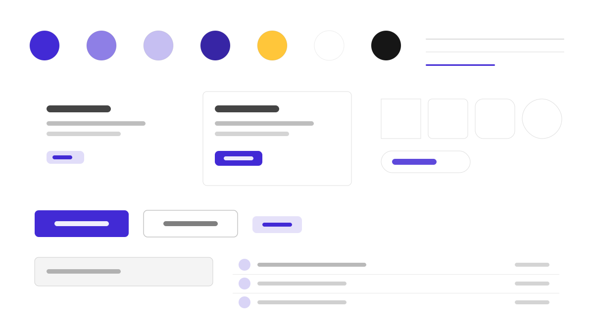
daisyUI 是在 Tailwind 之上补一层语义化组件的主题系统:用 btn、card、navbar、drawer 这类类名完成常用结构,30+ 内置主题开箱切换,默认主色紫(#570DF8)、辅色品红与青绿;0.5rem 圆角、柔和阴影与粉彩表面,悬停状态清晰友好,几乎不用写自定义 CSS。适合想保留 Tailwind 自由度又要组件语义的团队。
DaisyUI前端框架
提示词模板
基础模板
Design a daisyUI-inspired interface. - Semantic component classes on top of Tailwind: btn, card, navbar, drawer; - Theme system with 30+ built-in themes; light default primary #570DF8; - Rounded corners (0.5rem), soft shadows, pastel surfaces; - Friendly, approachable components with clear hover states; - Zero custom CSS — pure utility classes. Colors: #570DF8, #F000B8, #37CDBE, #FFFFFF with #570DF8 accent. Typography: system-ui.
变体提示词
📱 移动端
Design a mobile app with DaisyUI aesthetics. Use DaisyUI color identity with #570DF8 accents. Clean, touch-friendly, native feel.
💻 Web端
Design a web application with DaisyUI style. Use DaisyUI color identity with #570DF8 accents. Professional, responsive layout.
📊 仪表板
Design a dashboard with DaisyUI design language. Use DaisyUI color identity with #570DF8 accents. Data-rich, organized, clear hierarchy.
📄 落地页
Design a landing page with DaisyUI visual identity. Use DaisyUI color identity with #570DF8 accents. Compelling, conversion-focused.
使用示例
DaisyUI 落地页
落地页Build a landing page with daisyUI style: hero section, feature cards, and navbar using semantic Tailwind classes and #570DF8 accent.
DaisyUI 管理面板
仪表板Create an admin panel with daisyUI design language: drawer navigation, stat cards, and theme switcher with #570DF8 color system.
✅ 适合场景
- Tailwind CSS
- 快速原型
- 主题切换
❌ 不适合场景
- 需要原生 CSS 组件库的团队
- 深度自定义组件行为的项目
DESIGN.md 文件
符合 design.md 开放格式的设计系统描述,可复制或下载后交给 AI 编程工具使用。