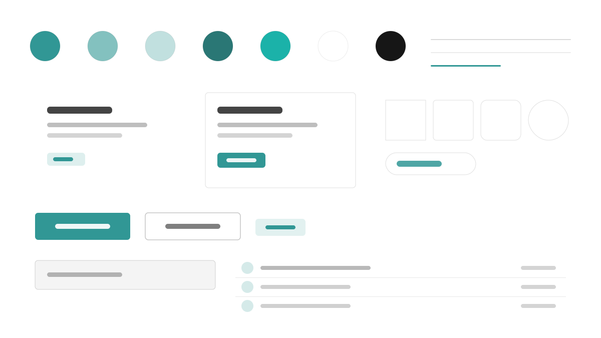
Chakra UI 是「简单、模块化、可访问」的 React 组件库:青绿主色(#319795)配 Gray 50-900 语义 token,Inter 以 16px 正文、600 标题与 1.6 行高提供舒适阅读;组件 6px 圆角、阴影薄而分层,每个可交互元素都有可见焦点环,间距走 4px 刻度并可用 style props 直接书写。适合表单密集、无障碍优先的 React 应用。
Chakra UI前端框架
提示词模板
基础模板
Design a Chakra UI-inspired interface. - Teal #319795 primary with semantic tokens across gray 50-900; - Inter with 16px body, 600-weight headings, balanced line-height 1.6; - 6px radii, faint layered shadows, visible focus rings on every interactive element; - Style-props-driven spacing on a 4px scale; - Friendly forms, badges, and accessible modal patterns. Colors: #319795, #FFFFFF, #EDF2F7, #1A202C with #319795 accent. Typography: Inter.
变体提示词
📱 移动端
Design a mobile app with Chakra UI aesthetics. Use Chakra UI color identity with #319795 accents. Clean, touch-friendly, native feel.
💻 Web端
Design a web application with Chakra UI style. Use Chakra UI color identity with #319795 accents. Professional, responsive layout.
📊 仪表板
Design a dashboard with Chakra UI design language. Use Chakra UI color identity with #319795 accents. Data-rich, organized, clear hierarchy.
📄 落地页
Design a landing page with Chakra UI visual identity. Use Chakra UI color identity with #319795 accents. Compelling, conversion-focused.
使用示例
Chakra UI SaaS 仪表板
仪表板Build a SaaS dashboard with Chakra UI style: sidebar layout, stat cards, data tables, and #319795 accent color.
Chakra UI 营销站点
落地页Create a marketing website with Chakra UI design language: hero, feature grids, pricing cards, and accessible form components.
✅ 适合场景
- React 项目
- 无障碍产品
- 设计系统
❌ 不适合场景
- 追求零运行时性能的项目
- 完全 Headless 的无样式需求
DESIGN.md 文件
符合 design.md 开放格式的设计系统描述,可复制或下载后交给 AI 编程工具使用。