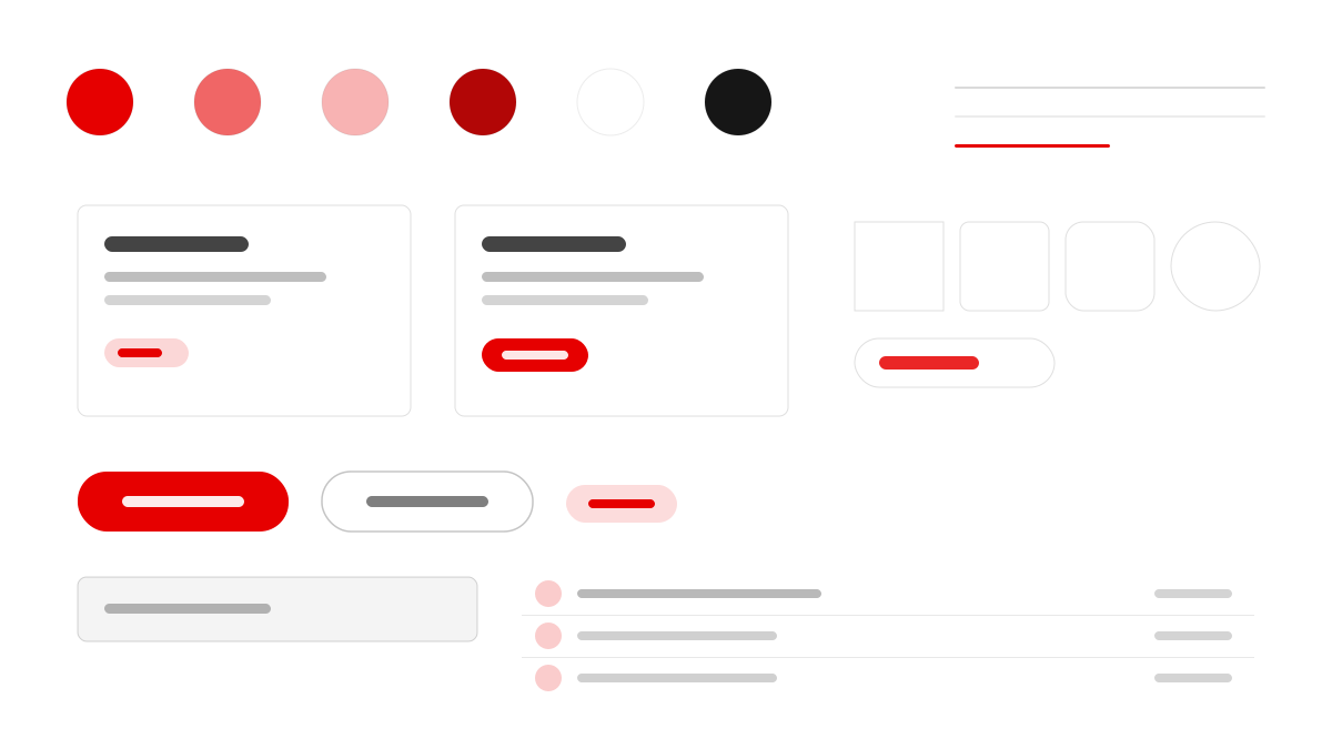
Vodafone 是全球電信營運商,連結個人、家庭與企業。其介面把 Vodafone 紅(#e60000)作為唯一的支配色——CTA、分隔條、色帶、語音商標乃至永續性地圖上旋轉的「IMPACT」字標都用它;144px、800 字重的大寫展示字與 16-18px 平靜內文形成張力,頁面有固定節奏:暗色氛圍主視覺區、巨型大寫標題、全寬紅帶、白色編輯畫布、炭灰機構面板;按鈕分 2px 直角(工具)與 60px 膠囊(內容 CTA)兩檔。適合電信與企業品牌頁。
Vodafone媒體與消費
提示詞範本
基礎範本
Design a Vodafone-inspired interface. - Vodafone Red (#e60000) is the single dominant accent — used for CTAs, dividers, band sections, the speech-mark logo, and the rotated "IMPACT" brand-mark type on the sustainability map; - Monumental uppercase display type (up to 144px, weight 800, negative letter-spacing) paired with calm 16-18px body copy; - A universal page rhythm: dark atmospheric hero → monumental uppercase headline → full-width red band → white editorial canvas → dark charcoal institutional panel → charcoal footer; - Two-tier button system: tight 2px-radius rectangles for utility actions, fully-pill 60px buttons for primary content CTAs (both equally primary, selected by context); - Documentary photography (people, infrastructure, cities, nature) dominates over illustration; no stock-icon noise. Colors: #e60000, #ffffff, #3860be, #ac1811 with #e60000 accent. Typography: Vodafone.
變體提示詞
📱 行動裝置
Design a mobile app with Vodafone aesthetics. Use Vodafone color identity with #e60000 accents. Clean, touch-friendly, native feel.
💻 Web 端
Design a web application with Vodafone style. Use Vodafone color identity with #e60000 accents. Professional, responsive layout.
📊 儀表板
Design a dashboard with Vodafone design language. Use Vodafone color identity with #e60000 accents. Data-rich, organized, clear hierarchy.
📄 到達頁
Design a landing page with Vodafone visual identity. Use Vodafone color identity with #e60000 accents. Compelling, conversion-focused.
使用範例
Vodafone 應用程式
Web 端Build a web app with Vodafone design language and #e60000 color system.
Vodafone 儀表板
儀表板Create a dashboard using Vodafone style with data visualization and Vodafone typography.
✅ 適用情境
- 消費級產品
- 電信品牌官網
- 展示型大字排版頁
❌ 不適用情境
- 極簡黑白工具
- 密集資料後台
DESIGN.md 檔案
符合 design.md 開放格式的設計系統描述,可複製或下載後交給 AI 程式設計工具使用。