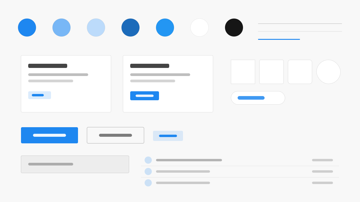
UIkit 是輕量模組化的前端框架,以「按需取用」著稱:主藍(#1E87F0)配 #F8F8F8 區塊表面與 #222 內文,4px 圓角與 .uk-card、.uk-navbar、.uk-button 等元件類覆蓋常見結構,工具類、Flex/Grid 與順滑動效一應俱全,版式均衡、內容優先。適合官網、文件網站與需要穩定輕量底座的 Web 專案。
UIkit前端框架
提示詞範本
基礎範本
Design a UIkit-inspired interface. - Lightweight modular front-end framework; - #1E87F0 primary with #F8F8F8 section surfaces and #222 text; - 4px radii, .uk-card/.uk-navbar/.uk-button components; - Utility-first classes, Flex/Grid support, and smooth animations; - Balanced, content-first layouts for products and docs. Colors: #1E87F0, #F8F8F8, #222222, #999999 with #1E87F0 accent. Typography: system-ui.
變體提示詞
📱 行動裝置
Design a mobile app with UIkit aesthetics. Use UIkit color identity with #1E87F0 accents. Clean, touch-friendly, native feel.
💻 Web 端
Design a web application with UIkit style. Use UIkit color identity with #1E87F0 accents. Professional, responsive layout.
📊 儀表板
Design a dashboard with UIkit design language. Use UIkit color identity with #1E87F0 accents. Data-rich, organized, clear hierarchy.
📄 到達頁
Design a landing page with UIkit visual identity. Use UIkit color identity with #1E87F0 accents. Compelling, conversion-focused.
使用範例
UIkit 文件網站
Web 端Build a documentation site with UIkit style: sticky navigation, content cards, and #1E87F0 accents.
UIkit 產品到達頁
到達頁Create a product landing page with UIkit design language: hero section, feature grids, and smooth scroll animations.
✅ 適用情境
- 輕量網站
- 文件網站
- 模組化建構
❌ 不適用情境
- React 或 Vue 元件生態系專案
- 深度客製設計系統
DESIGN.md 檔案
符合 design.md 開放格式的設計系統描述,可複製或下載後交給 AI 程式設計工具使用。