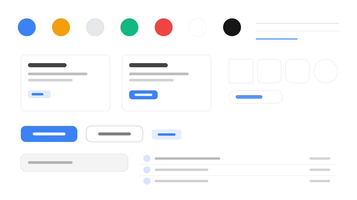
Tremor 是專注資料視覺化的 React + Tailwind 元件庫,被 Vercel 收購後延續開源與 copy-paste 模式。其介面以白畫布配淺灰描邊(#e5e7eb)保持乾淨,Tremor 藍(#3b82f6)統領圖表、KPI 與互動元素,Inter 以 400-600 字重保證資料密集下的易讀性,卡片模組化版面、12-16px 圓角,面積圖、柱狀圖、進度條與迷你走勢線就是它的主要視覺語言。適合儀表板與分析產品。
Tremor專業與企業
提示詞範本
基礎範本
Design a Tremor-inspired interface. - Clean white canvas with subtle gray borders (#e5e7eb); - Tremor Blue (#3b82f6) as primary accent for charts, KPIs, and interactive elements; - Inter typeface at weights 400–600 for data-dense readability; - Modular card-based layout with 12–16px radius; - Data visualization as the primary visual language: area charts, bar charts, progress bars, sparklines. Colors: #3b82f6, #10b981, #f59e0b, #ef4444 with #3b82f6 accent. Typography: Inter.
變體提示詞
📱 行動裝置
Design a mobile app with Tremor aesthetics. Use Tremor color identity with #3b82f6 accents. Clean, touch-friendly, native feel.
💻 Web 端
Design a web application with Tremor style. Use Tremor color identity with #3b82f6 accents. Professional, responsive layout.
📊 儀表板
Design a dashboard with Tremor design language. Use Tremor color identity with #3b82f6 accents. Data-rich, organized, clear hierarchy with charts and KPI cards.
📄 到達頁
Design a landing page with Tremor visual identity. Use Tremor color identity with #3b82f6 accents. Compelling, conversion-focused.
使用範例
Tremor 分析儀表板
儀表板Build a data analytics dashboard with Tremor design language, area charts, KPI cards, and #3b82f6 color system.
Tremor 管理面板
Web 端Create an admin panel using Tremor style with data tables, progress indicators, and Inter typography.
✅ 適用情境
- 企業級產品
- 資料儀表板
- 資料視覺化
❌ 不適用情境
- 以內容閱讀為主的網站
- 遊戲化社交介面
DESIGN.md 檔案
符合 design.md 開放格式的設計系統描述,可複製或下載後交給 AI 程式設計工具使用。