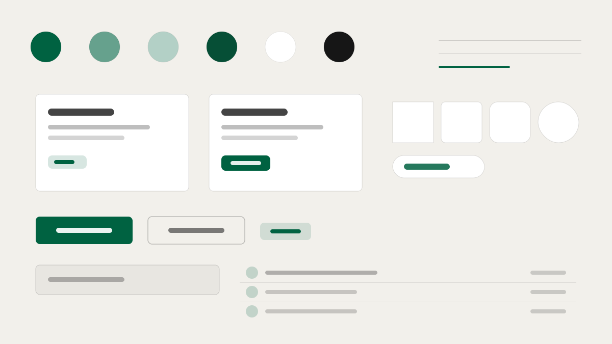
星巴克是全球咖啡零售品牌,其介面用四層綠色體系(Starbucks、Accent、House、Uplift)各司其職,而不是籠統的「品牌綠」;金色只屬於會員等級時刻,絕不作為通用強調;畫布是暖中性色(#f2f0eb/#edebe9)而非冷白,呼應咖啡店材質;SoDoSans 以 -0.16px 的緊湊字距作為統一聲音,Rewards 區切換襯線、招募頁甚至用麥克筆字樣寫名字。適合零售、會員體系與生活風格品牌。
Starbucks電商與零售
提示詞範本
基礎範本
Design a Starbucks-inspired interface. - Four-tier green brand system (Starbucks / Accent / House / Uplift) each mapped to a distinct surface role — not a single "brand green"; - Gold reserved for Rewards-status moments only; never a general-purpose accent; - Warm-neutral canvas (#f2f0eb / #edebe9) instead of cold white — references café materials; - Custom proprietary typeface (SoDoSans) with tight -0.16px letter-spacing as the universal voice; - Context-specific type switches: serif (Lander Tall) for Rewards, script (Kalam) for Careers cup-names. Colors: #006241, #00754A, #1E3932, #2b5148 with #006241 accent. Typography: for Rewards utility zones and hero bands..
變體提示詞
📱 行動裝置
Design a mobile app with Starbucks aesthetics. Use Starbucks color identity with #006241 accents. Clean, touch-friendly, native feel.
💻 Web 端
Design a web application with Starbucks style. Use Starbucks color identity with #006241 accents. Professional, responsive layout.
📊 儀表板
Design a dashboard with Starbucks design language. Use Starbucks color identity with #006241 accents. Data-rich, organized, clear hierarchy.
📄 到達頁
Design a landing page with Starbucks visual identity. Use Starbucks color identity with #006241 accents. Compelling, conversion-focused.
使用範例
Starbucks 應用程式
Web 端Build a web app with Starbucks design language and #006241 color system.
Starbucks 儀表板
儀表板Create a dashboard using Starbucks style with data visualization and for Rewards utility zones and hero bands. typography.
✅ 適用情境
- 電商情境
- 零售品牌官網
- 會員與門市體驗頁
❌ 不適用情境
- 冷峻科技介面
- 實驗性反設計
DESIGN.md 檔案
符合 design.md 開放格式的設計系統描述,可複製或下載後交給 AI 程式設計工具使用。