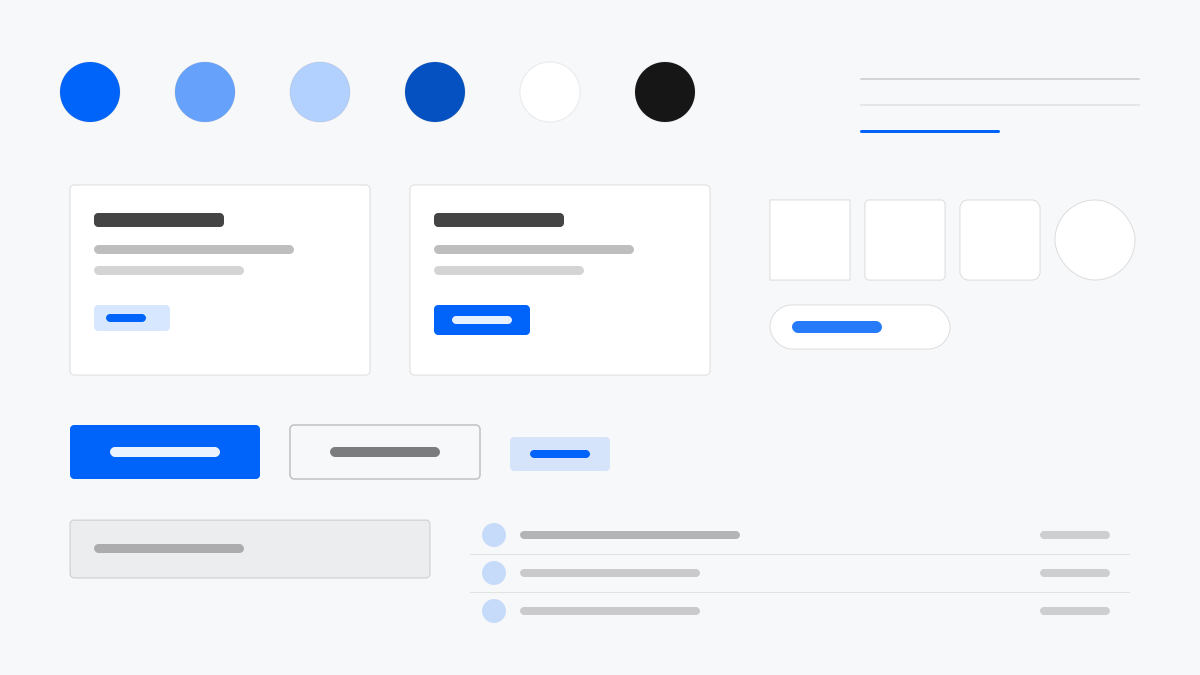
Semi Design 是字節跳動的設計系統,主張「使用者中心、內容優先、對人友善」。React 實作下主藍(#0064FA)展開 10 級色階並配完整深色主題,4px 圓角、1px #E5E6EB 描邊與 32px 緊湊控制項適配高密度業務;表格、表單與長流程資料工作流程被打磨得順滑,焦點態與語意色 token 精細。適合內容與資料並重的企業級 React 產品。
Semi Design設計系統
提示詞範本
基礎範本
Design a Semi Design-inspired interface. - ByteDance design system with React components; - #0064FA primary blue with 10-step ramps and a full dark theme; - 4px radii, 1px #E5E6EB borders, compact 32px controls; - Dense tables, forms, and long-form data workflows; - Refined focus states and semantic color tokens. Colors: #0064FA, #E5E6EB, #F7F8FA, #1C1F23 with #0064FA accent. Typography: Inter.
變體提示詞
📱 行動裝置
Design a mobile app with Semi Design aesthetics. Use Semi Design color identity with #0064FA accents. Clean, touch-friendly, native feel.
💻 Web 端
Design a web application with Semi Design style. Use Semi Design color identity with #0064FA accents. Professional, responsive layout.
📊 儀表板
Design a dashboard with Semi Design design language. Use Semi Design color identity with #0064FA accents. Data-rich, organized, clear hierarchy.
📄 到達頁
Design a landing page with Semi Design visual identity. Use Semi Design color identity with #0064FA accents. Compelling, conversion-focused.
使用範例
Semi Design 資料儀表板
儀表板Build a data dashboard with Semi Design style: dense tables, filter forms, and #0064FA accent with dark mode support.
Semi Design 企業主控台
Web 端Create an enterprise console with Semi Design language: navigation sidebar, form workflows, and refined focus states.
✅ 適用情境
- React 專案
- 企業產品
- 深色模式應用
❌ 不適用情境
- 非 React 專案
- 重品牌個性的行銷頁
DESIGN.md 檔案
符合 design.md 開放格式的設計系統描述,可複製或下載後交給 AI 程式設計工具使用。