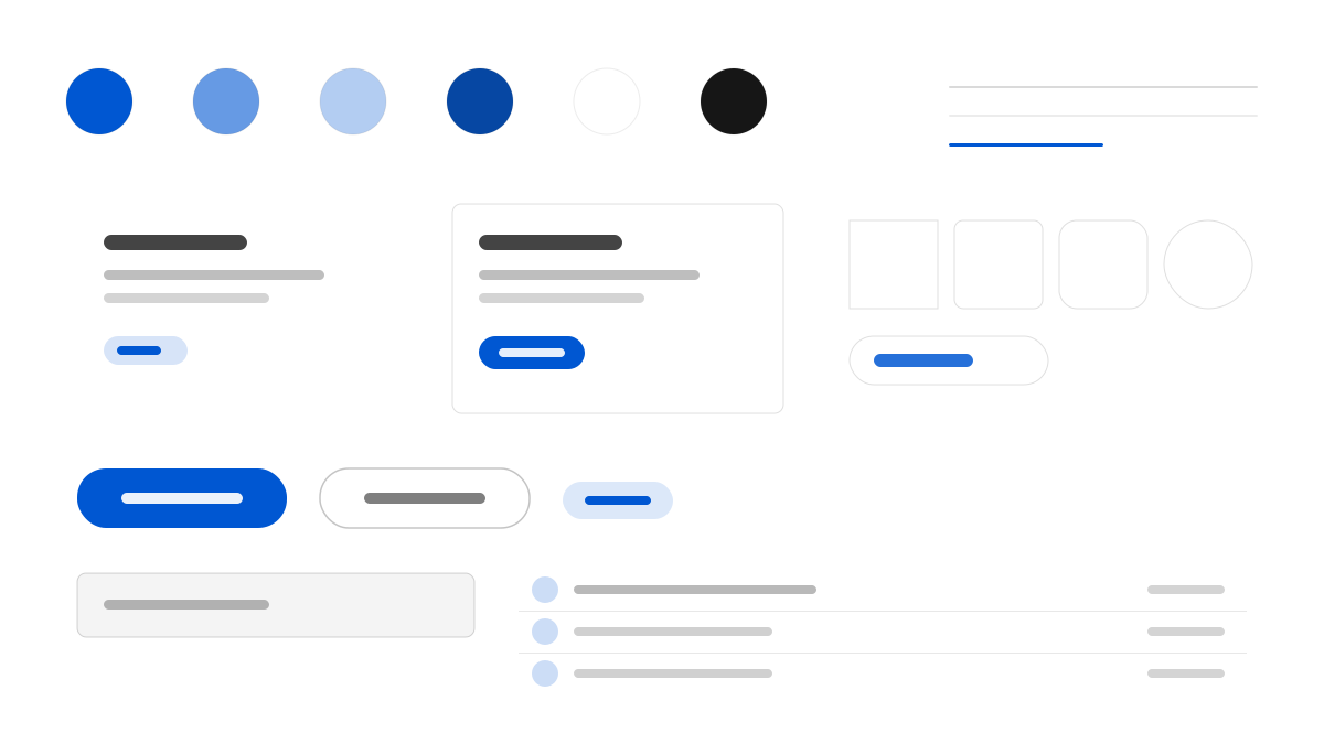
SAP 把網頁做成一扇應用程式視窗:60px 的 #f5f6f7 全域導覽列上再疊一條麵包屑與產品標籤列,讀者還沒看到標題就先知道自己身處龐大產品目錄的哪一層。主體近七成是白色 #ffffff,分區靠 #f5f6f7、#eaecee、#ebf8ff、#f7f4ff 四條全寬平色帶完成,一律直角、不做陰影。唯一會「行動」的顏色是 SAP 藍 #0057d2,按鈕、行內連結和目前標籤共用它;72 Brand Variable 以 350 到 700 的字重跨度,讓同為 15px 的清單項目與導覽項目讀起來像兩種文字。
SAP專業與企業
提示詞範本
基礎範本
Design an SAP-inspired interface. - Two-storey chrome: a 60px #f5f6f7 global bar above a breadcrumb and product tab rail; - A white #ffffff canvas separated by full-width flat bands in #f5f6f7, #eaecee, #ebf8ff and #f7f4ff, all square-cornered and unshadowed; - SAP blue #0057d2 as the only acting colour on buttons, inline links and the active tab, with deep blue #0040b0 for interior hero bands; - A five-tier text ladder from true black through #3c3c3c and slate #223548, #354a5f and #475e75, plus neutral #545454 for chrome; - 72 Brand Variable spanning weights 350 to 700, so a 15px list item at 350 and a 15px nav link at 400 read as different classes of text; - Corners capped at 8px for controls and 12px for media, never a pill. Colors: #ffffff, #f5f6f7, #0057d2, #0040b0 with #0057d2 accent. Typography: 72 Brand Variable.
變體提示詞
📱 行動裝置
Design a mobile app with SAP aesthetics. Keep the chrome light, stack white content above flat bands and let SAP blue #0057d2 mark every action. Clean, touch-friendly, native feel.
💻 Web 端
Design a web application with SAP style. Place a 60px chrome bar over a product tab rail, then separate white sections with full-width flat bands. Professional, responsive layout.
📊 儀表板
Design a dashboard with SAP design language. Use the slate text ladder, 8px controls and blue only for active states, with hairlines doing the dividing. Data-rich, organized, clear hierarchy.
📄 到達頁
Design a landing page with SAP visual identity. Open with a navy gradient or a deep-blue hero band, then return to white and full-width bands. Compelling, conversion-focused.
使用範例
SAP 產品入口網站
到達頁Build a product portal with SAP design language: two-storey chrome, a deep blue hero band and white content sections.
SAP 營運主控台
儀表板Create a dashboard using SAP style with slate text tiers, 8px controls and blue reserved for active states.
✅ 適用情境
- ERP 與供應鏈管理後台
- B2B 企業服務產品頁
- 面向 IT 採購者的方案入口網站
❌ 不適用情境
- 強調情緒與氛圍的時尚品牌網站
- 輕量消費級社群應用
DESIGN.md 檔案
符合 design.md 開放格式的設計系統描述,可複製或下載後交給 AI 程式設計工具使用。