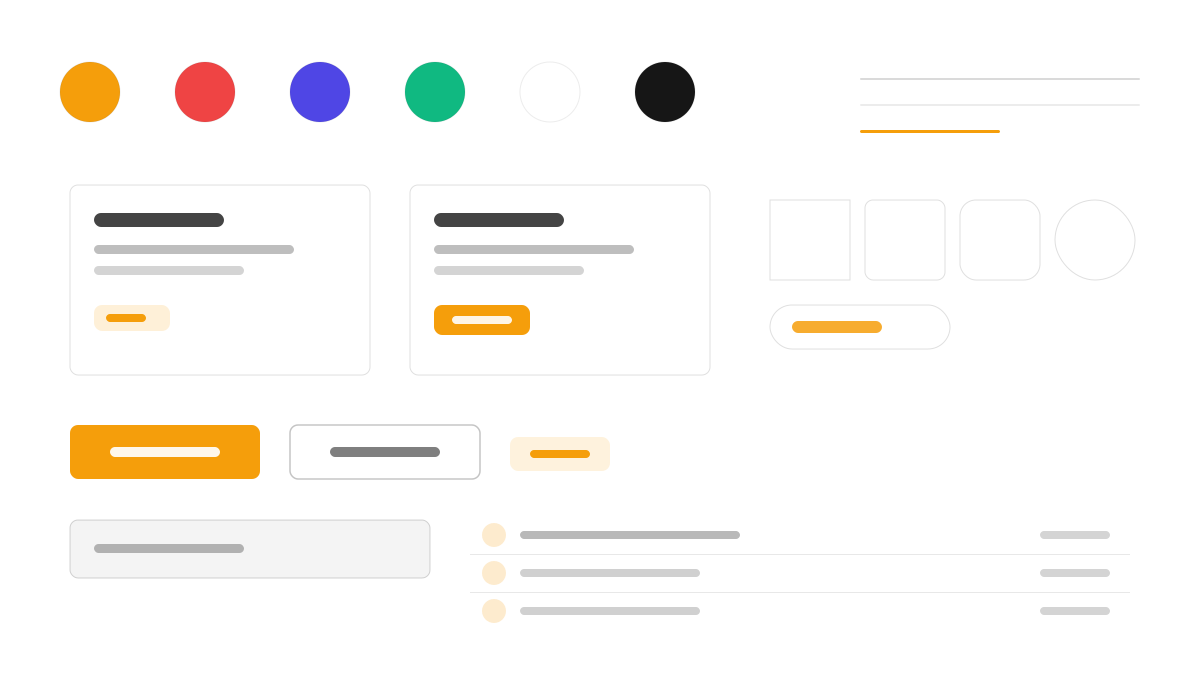
FlyonUI 是把 daisyUI 式語意類名與 Headless UI 的 JS 互動合而為一的 Tailwind 元件庫:btn、card、alert 這類類名開箱即用,選單、模態視窗、下拉等 60+ 互動元件由 Headless UI 驅動,React 與 Vue 雙相容,深色模式透過 CSS 變數主題切換,主色靛藍(#4F46E5)。適合想以最小配置獲得成套互動元件的團隊。
FlyonUI前端框架
提示詞範本
基礎範本
Design a FlyonUI-inspired interface. - Semantic Tailwind class names like daisyUI: btn, card, alert; - Headless UI JavaScript interactions for menus, modals, dropdowns; - React and Vue compatible; - 60+ interactive components with clean defaults; - Dark mode support with CSS variable theming. Colors: #4F46E5, #10B981, #F59E0B, #EF4444 with #4F46E5 accent. Typography: system-ui.
變體提示詞
📱 行動裝置
Design a mobile app with FlyonUI aesthetics. Use FlyonUI color identity with #4F46E5 accents. Clean, touch-friendly, native feel.
💻 Web 端
Design a web application with FlyonUI style. Use FlyonUI color identity with #4F46E5 accents. Professional, responsive layout.
📊 儀表板
Design a dashboard with FlyonUI design language. Use FlyonUI color identity with #4F46E5 accents. Data-rich, organized, clear hierarchy.
📄 到達頁
Design a landing page with FlyonUI visual identity. Use FlyonUI color identity with #4F46E5 accents. Compelling, conversion-focused.
使用範例
FlyonUI Web 應用
Web 端Build a web app with FlyonUI design language, semantic Tailwind classes, and #4F46E5 color system.
FlyonUI 儀表板
儀表板Create a dashboard using FlyonUI style with interactive components and dark mode theming.
✅ 適用情境
- 框架生態系
- 快速原型
- 多框架專案
❌ 不適用情境
- 完全自訂互動的情境
- 脫離 Tailwind 的專案
DESIGN.md 檔案
符合 design.md 開放格式的設計系統描述,可複製或下載後交給 AI 程式設計工具使用。