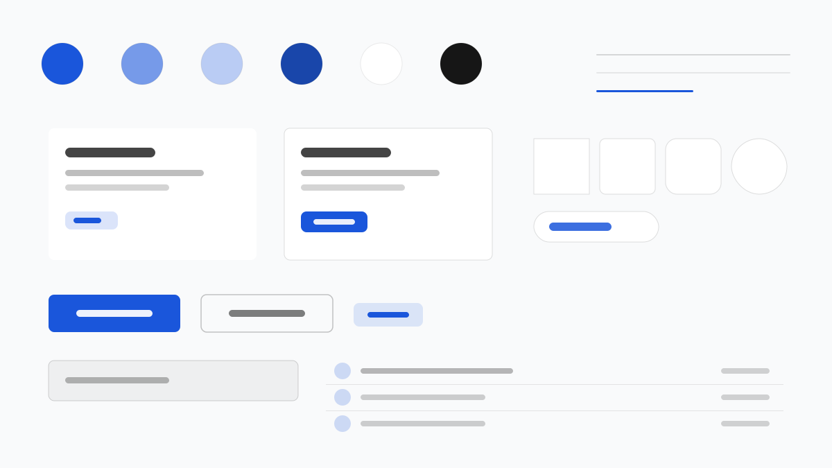
Flowbite 是建立在 Tailwind CSS 之上的元件庫,以「複製即用」的模式提供從儀表板、表單到行銷區塊的成套模式;主藍(#1A56DB)統領 Gray 50-900 灰階,元件多用 8px 圓角與克制陰影,深色模式透過 dark: 變體一等公民地支援。適合快速交付管理後台與行銷網站的團隊。
Flowbite前端框架
提示詞範本
基礎範本
Design a Flowbite-inspired interface. - Tailwind CSS component library with copy-paste patterns; - #1A56DB primary over a gray 50-900 scale; - 8px radii, rounded-lg cards and buttons, subtle shadows; - First-class dark mode via dark: variants; - Dashboards, forms, and marketing blocks as standard fixtures. Colors: #1A56DB, #F9FAFB, #111827, #6B7280 with #1A56DB accent. Typography: Inter.
變體提示詞
📱 行動裝置
Design a mobile app with Flowbite aesthetics. Use Flowbite color identity with #1A56DB accents. Clean, touch-friendly, native feel.
💻 Web 端
Design a web application with Flowbite style. Use Flowbite color identity with #1A56DB accents. Professional, responsive layout.
📊 儀表板
Design a dashboard with Flowbite design language. Use Flowbite color identity with #1A56DB accents. Data-rich, organized, clear hierarchy.
📄 到達頁
Design a landing page with Flowbite visual identity. Use Flowbite color identity with #1A56DB accents. Compelling, conversion-focused.
使用範例
Flowbite SaaS 儀表板
儀表板Build a SaaS dashboard with Flowbite style: sidebar navigation, KPI cards, charts, and #1A56DB accent color.
Flowbite 行銷區塊
到達頁Create a marketing page with Flowbite design language: hero, pricing tables, testimonials, and dark mode support.
✅ 適用情境
- Tailwind CSS
- 儀表板
- 深色模式網站
❌ 不適用情境
- 非 Tailwind 的樣式體系
- 複雜狀態管理的重型應用
DESIGN.md 檔案
符合 design.md 開放格式的設計系統描述,可複製或下載後交給 AI 程式設計工具使用。