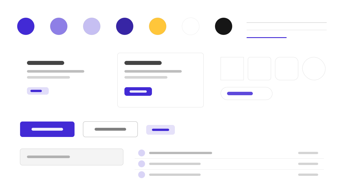
daisyUI 是在 Tailwind 之上補一層語意化元件的主題系統:用 btn、card、navbar、drawer 這類類名完成常用結構,30+ 內建主題開箱切換,預設主色紫(#570DF8)、輔色洋紅與青綠;0.5rem 圓角、柔和陰影與粉彩表面,懸停狀態清晰友善,幾乎不用寫自訂 CSS。適合想保留 Tailwind 自由度又要元件語意的團隊。
DaisyUI前端框架
提示詞範本
基礎範本
Design a daisyUI-inspired interface. - Semantic component classes on top of Tailwind: btn, card, navbar, drawer; - Theme system with 30+ built-in themes; light default primary #570DF8; - Rounded corners (0.5rem), soft shadows, pastel surfaces; - Friendly, approachable components with clear hover states; - Zero custom CSS — pure utility classes. Colors: #570DF8, #F000B8, #37CDBE, #FFFFFF with #570DF8 accent. Typography: system-ui.
變體提示詞
📱 行動裝置
Design a mobile app with DaisyUI aesthetics. Use DaisyUI color identity with #570DF8 accents. Clean, touch-friendly, native feel.
💻 Web 端
Design a web application with DaisyUI style. Use DaisyUI color identity with #570DF8 accents. Professional, responsive layout.
📊 儀表板
Design a dashboard with DaisyUI design language. Use DaisyUI color identity with #570DF8 accents. Data-rich, organized, clear hierarchy.
📄 到達頁
Design a landing page with DaisyUI visual identity. Use DaisyUI color identity with #570DF8 accents. Compelling, conversion-focused.
使用範例
DaisyUI 到達頁
到達頁Build a landing page with daisyUI style: hero section, feature cards, and navbar using semantic Tailwind classes and #570DF8 accent.
DaisyUI 管理面板
儀表板Create an admin panel with daisyUI design language: drawer navigation, stat cards, and theme switcher with #570DF8 color system.
✅ 適用情境
- Tailwind CSS
- 快速原型
- 主題切換
❌ 不適用情境
- 需要原生 CSS 元件庫的團隊
- 深度自訂元件行為的專案
DESIGN.md 檔案
符合 design.md 開放格式的設計系統描述,可複製或下載後交給 AI 程式設計工具使用。