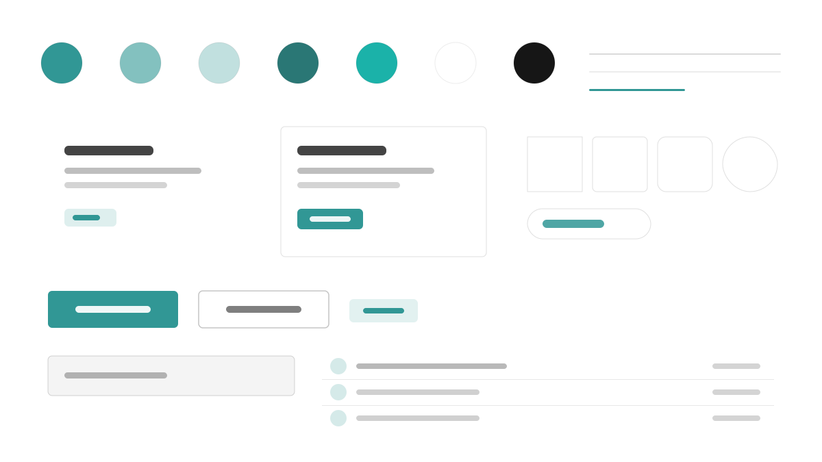
Chakra UI 是「簡單、模組化、可存取」的 React 元件庫:青綠主色(#319795)配 Gray 50-900 語意 token,Inter 以 16px 內文、600 標題與 1.6 行高提供舒適閱讀;元件 6px 圓角、陰影薄而分層,每個可互動元素都有可見焦點環,間距走 4px 刻度並可用 style props 直接書寫。適合表單密集、無障礙優先的 React 應用。
Chakra UI前端框架
提示詞範本
基礎範本
Design a Chakra UI-inspired interface. - Teal #319795 primary with semantic tokens across gray 50-900; - Inter with 16px body, 600-weight headings, balanced line-height 1.6; - 6px radii, faint layered shadows, visible focus rings on every interactive element; - Style-props-driven spacing on a 4px scale; - Friendly forms, badges, and accessible modal patterns. Colors: #319795, #FFFFFF, #EDF2F7, #1A202C with #319795 accent. Typography: Inter.
變體提示詞
📱 行動裝置
Design a mobile app with Chakra UI aesthetics. Use Chakra UI color identity with #319795 accents. Clean, touch-friendly, native feel.
💻 Web 端
Design a web application with Chakra UI style. Use Chakra UI color identity with #319795 accents. Professional, responsive layout.
📊 儀表板
Design a dashboard with Chakra UI design language. Use Chakra UI color identity with #319795 accents. Data-rich, organized, clear hierarchy.
📄 到達頁
Design a landing page with Chakra UI visual identity. Use Chakra UI color identity with #319795 accents. Compelling, conversion-focused.
使用範例
Chakra UI SaaS 儀表板
儀表板Build a SaaS dashboard with Chakra UI style: sidebar layout, stat cards, data tables, and #319795 accent color.
Chakra UI 行銷網站
到達頁Create a marketing website with Chakra UI design language: hero, feature grids, pricing cards, and accessible form components.
✅ 適用情境
- React 專案
- 無障礙產品
- 設計系統
❌ 不適用情境
- 追求零執行時效能的專案
- 完全 Headless 的無樣式需求
DESIGN.md 檔案
符合 design.md 開放格式的設計系統描述,可複製或下載後交給 AI 程式設計工具使用。