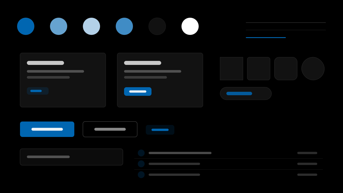
BMW M 是寶馬的賽車運動子品牌,介面是「駕駛艙視角」:近純黑畫布搭配白色文字,M 三色條紋(淺藍/深藍/紅)只以 4px 品牌飾條、M 字標與賽車鍍鉻件形式出現,絕不用於按鈕或填色;攝影滿版鋪底,車輛永遠是視覺主體,UI 退居為照片上的小號白色標籤;按鈕扁平、零圓角、大寫加寬字距——矩形輪廓本身就是品牌。適合性能品牌與運動敘事介面。
BMW M汽車
提示詞範本
基礎範本
Design a BMW M-inspired interface. - Near-pure black canvas ({colors.canvas} — #000) with white type across the analyzed editorial and marketing pages. Configurator, account, checkout, and order-management flows are unresolved and may introduce light surfaces.; - Display headlines use UPPERCASE BMW Type Next Latin Light when following the BMW family system. Heavier uppercase settings are reserved for labels, buttons, card titles, and observed M-specific emphasis.; - M tricolor ({colors.m-blue-light} / {colors.m-blue-dark} / {colors.m-red}) used as 4px brand-stripe dividers, M-wordmark accents, and motorsport chrome — never as buttons or fills.; - Photography fills entire bands edge-to-edge. Cars are always the visual subject; UI chrome backs off to small white labels overlaid on photography.; - Buttons are flat with 0px corners and uppercase letterspaced labels. The "industrial precision" rectangular silhouette IS the brand.. Typography: (#ffffff):.變體提示詞
📱 行動裝置
Design a mobile app with BMW M aesthetics. Clean, touch-friendly, native feel.
💻 Web 端
Design a web application with BMW M style. Professional, responsive layout.
📊 儀表板
Design a dashboard with BMW M design language. Data-rich, organized, clear hierarchy.
📄 到達頁
Design a landing page with BMW M visual identity. Compelling, conversion-focused.
使用範例
BMW M 應用程式
Web 端Build a web app with BMW M design language and brand color system.
BMW M 儀表板
儀表板Create a dashboard using BMW M style with data visualization and (#ffffff): typography.
✅ 適用情境
- 汽車產業
- 賽車與性能主題頁
- 深色運動化介面
❌ 不適用情境
- 溫和居家產品
- 明亮教育介面
DESIGN.md 檔案
符合 design.md 開放格式的設計系統描述,可複製或下載後交給 AI 程式設計工具使用。