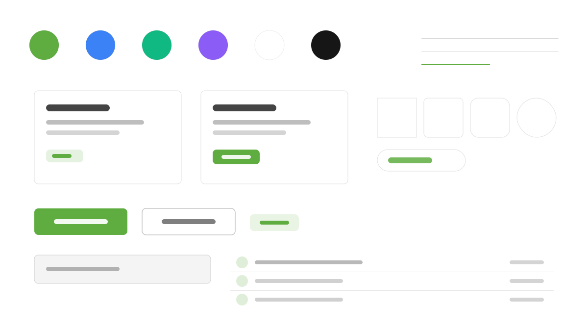
Ark UI 是跨框架的 Headless 基礎元件庫:45+ 元件完全無樣式,把 CSS 交給你的 Tailwind;行為層由 Zag.js 狀態機驅動,元件表現可預測、可測試;React、Vue、Solid、Svelte 共用同一套 API,ARIA 角色、鍵盤導覽與焦點管理天然符合 WCAG。適合自建設計系統的團隊與多框架程式碼庫。
Ark UI前端框架
提示詞範本
基礎範本
Design a Ark UI-inspired interface. - Completely unstyled headless primitives — bring your own CSS with Tailwind; - Zag.js state machine-driven: predictable, testable component behavior; - WCAG-compliant accessibility: ARIA roles, keyboard navigation, focus management; - Same API across React, Vue, Solid, and Svelte; - 50+ composable components: Dialog, Menu, Tabs, Accordion, Carousel, and more. Colors: #5FAD41, #10B981, #3B82F6, #8B5CF6 with #5FAD41 accent. Typography: system-ui.
變體提示詞
📱 行動裝置
Design a mobile app with Ark UI aesthetics. Use Ark UI color identity with #5FAD41 accents. Clean, touch-friendly, native feel.
💻 Web 端
Design a web application with Ark UI style. Use Ark UI color identity with #5FAD41 accents. Professional, responsive layout.
📊 儀表板
Design a dashboard with Ark UI design language. Use Ark UI color identity with #5FAD41 accents. Data-rich, organized, clear hierarchy.
📄 到達頁
Design a landing page with Ark UI visual identity. Use Ark UI color identity with #5FAD41 accents. Compelling, conversion-focused.
使用範例
Ark UI 元件展示
Web 端Build a component showcase with Ark UI design language, accessible dialogs, menus, and #5FAD41 color system.
Ark UI 儀表板
儀表板Create a dashboard using Ark UI style with headless primitives styled by Tailwind CSS.
✅ 適用情境
- 框架生態系
- 設計系統底座
- 跨框架專案
❌ 不適用情境
- 需要現成視覺樣式的專案
- 純 CSS 無 JS 的靜態網站
DESIGN.md 檔案
符合 design.md 開放格式的設計系統描述,可複製或下載後交給 AI 程式設計工具使用。