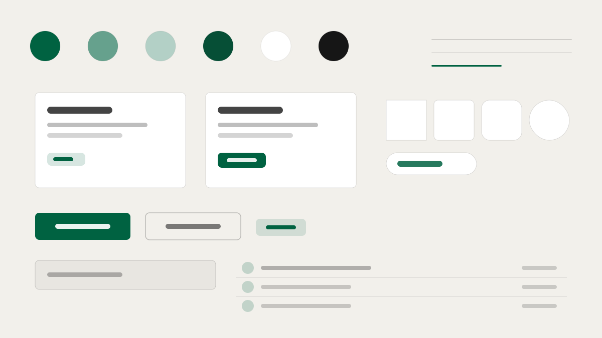
Starbucks はグローバルなコーヒー小売ブランドで、UI は 4 層のグリーン体系(Starbucks、Accent、House、Uplift)がそれぞれの役割を担い、大雑把な「ブランドグリーン」ではありません。ゴールドは会員ランクの瞬間にのみ属し、汎用の強調色としては決して使われません。キャンバスは冷たい白ではなく暖かな中間色(#f2f0eb/#edebe9)で、コーヒーショップの素材感と呼応します。SoDoSans は -0.16px の詰まった字間で統一された声となり、Rewards エリアではセリフ体に切り替わり、採用ページではマーカーのような手書き文字で名前を書くことさえあります。小売、会員体系、ライフスタイルブランドに適しています。
StarbucksEC と小売
プロンプトテンプレート
基本テンプレート
Design a Starbucks-inspired interface. - Four-tier green brand system (Starbucks / Accent / House / Uplift) each mapped to a distinct surface role — not a single "brand green"; - Gold reserved for Rewards-status moments only; never a general-purpose accent; - Warm-neutral canvas (#f2f0eb / #edebe9) instead of cold white — references café materials; - Custom proprietary typeface (SoDoSans) with tight -0.16px letter-spacing as the universal voice; - Context-specific type switches: serif (Lander Tall) for Rewards, script (Kalam) for Careers cup-names. Colors: #006241, #00754A, #1E3932, #2b5148 with #006241 accent. Typography: for Rewards utility zones and hero bands..
バリエーションプロンプト
📱 モバイル
Design a mobile app with Starbucks aesthetics. Use Starbucks color identity with #006241 accents. Clean, touch-friendly, native feel.
💻 Web
Design a web application with Starbucks style. Use Starbucks color identity with #006241 accents. Professional, responsive layout.
📊 ダッシュボード
Design a dashboard with Starbucks design language. Use Starbucks color identity with #006241 accents. Data-rich, organized, clear hierarchy.
📄 ランディングページ
Design a landing page with Starbucks visual identity. Use Starbucks color identity with #006241 accents. Compelling, conversion-focused.
使用例
Starbucks アプリ
WebBuild a web app with Starbucks design language and #006241 color system.
Starbucks ダッシュボード
ダッシュボードCreate a dashboard using Starbucks style with data visualization and for Rewards utility zones and hero bands. typography.
✅ 適した用途
- EC のシーン
- 小売ブランドの公式サイト
- 会員と店舗体験のページ
❌ 適さない用途
- 冷徹なテック UI
- 実験的なアンチデザイン
DESIGN.md ファイル
design.md オープン形式に準拠したデザインシステム記述。コピーまたはダウンロードして AI コーディングツールに渡せます。