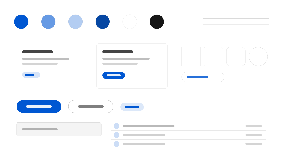
SAP はページをアプリケーションのウィンドウのように扱います。高さ 60px の #f5f6f7 のグローバルバーの下にパンくずと製品タブのバーが並び、見出しを読む前に大規模なカタログの中の位置が分かります。画面の約七割は白 #ffffff のままで、#f5f6f7、#eaecee、#ebf8ff、#f7f4ff の四本の全幅フラットバンドが角を丸めずにセクションを区切ります。動作を示す色は SAP ブルー #0057d2 だけで、ボタン、インラインテキストリンク、選択中のタブが共有します。72 Brand Variable はウェイト 350 から 700 まで使われ、同じ 15px でもリスト項目とナビ項目が別のテキスト種別に読めます。
SAPプロフェッショナルとエンタープライズ
プロンプトテンプレート
基本テンプレート
Design an SAP-inspired interface. - Two-storey chrome: a 60px #f5f6f7 global bar above a breadcrumb and product tab rail; - A white #ffffff canvas separated by full-width flat bands in #f5f6f7, #eaecee, #ebf8ff and #f7f4ff, all square-cornered and unshadowed; - SAP blue #0057d2 as the only acting colour on buttons, inline links and the active tab, with deep blue #0040b0 for interior hero bands; - A five-tier text ladder from true black through #3c3c3c and slate #223548, #354a5f and #475e75, plus neutral #545454 for chrome; - 72 Brand Variable spanning weights 350 to 700, so a 15px list item at 350 and a 15px nav link at 400 read as different classes of text; - Corners capped at 8px for controls and 12px for media, never a pill. Colors: #ffffff, #f5f6f7, #0057d2, #0040b0 with #0057d2 accent. Typography: 72 Brand Variable.
バリエーションプロンプト
📱 モバイル
Design a mobile app with SAP aesthetics. Keep the chrome light, stack white content above flat bands and let SAP blue #0057d2 mark every action. Clean, touch-friendly, native feel.
💻 Web
Design a web application with SAP style. Place a 60px chrome bar over a product tab rail, then separate white sections with full-width flat bands. Professional, responsive layout.
📊 ダッシュボード
Design a dashboard with SAP design language. Use the slate text ladder, 8px controls and blue only for active states, with hairlines doing the dividing. Data-rich, organized, clear hierarchy.
📄 ランディングページ
Design a landing page with SAP visual identity. Open with a navy gradient or a deep-blue hero band, then return to white and full-width bands. Compelling, conversion-focused.
使用例
SAP 製品ポータル
ランディングページBuild a product portal with SAP design language: two-storey chrome, a deep blue hero band and white content sections.
SAP 運用コンソール
ダッシュボードCreate a dashboard using SAP style with slate text tiers, 8px controls and blue reserved for active states.
✅ 適した用途
- ERP とサプライチェーン管理コンソール
- B2B エンタープライズサービスのページ
- IT 購買担当者向けソリューションポータル
❌ 適さない用途
- 情緒と雰囲気を重視するファッションブランドサイト
- 軽量なコンシューマー向けソーシャルアプリ
DESIGN.md ファイル
design.md オープン形式に準拠したデザインシステム記述。コピーまたはダウンロードして AI コーディングツールに渡せます。