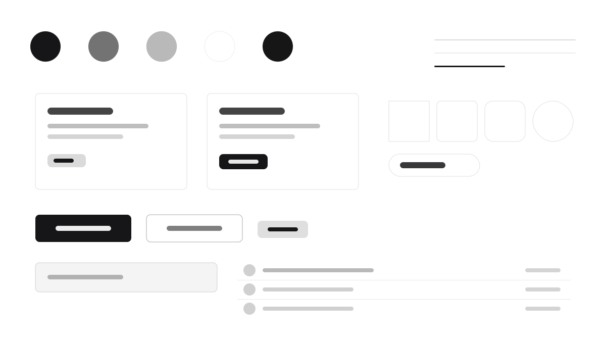
Radix UI はヘッドレスプリミティブのパイオニアです。Dialog、DropdownMenu、Tooltip、Tabs は振る舞いとアクセシビリティのみを提供し、スキンは完全にあなたが決めます。公式サンプルはほぼ黒(#161618)のサーフェスに高コントラストの白文字、Inter の詰まった字間、8px の角丸、低透明度のヘアラインボーダーで示され、フォーカスリングは高コントラスト、スタイルは data-state で駆動します。ゼロからデザインシステムを構築したい、信頼できるインタラクションの基盤だけが欲しいチームに適しています。
Radix UIフロントエンドフレームワーク
プロンプトテンプレート
基本テンプレート
Design a Radix UI-inspired interface. - Unstyled, accessible primitives: Dialog, DropdownMenu, Tooltip, Tabs; - Near-black #161618 surfaces with crisp white text; - Inter with tight tracking; 8px radii, hairline borders at low white opacity; - High-contrast focus rings and data-state driven styling; - Bring your own visual layer — Radix ships behavior, not skin. Colors: #161618, #FFFFFF, #1F1F23, #2A2A30 with #161618 accent. Typography: Inter.
バリエーションプロンプト
📱 モバイル
Design a mobile app with Radix UI aesthetics. Use Radix UI color identity with #161618 accents. Clean, touch-friendly, native feel.
💻 Web
Design a web application with Radix UI style. Use Radix UI color identity with #161618 accents. Professional, responsive layout.
📊 ダッシュボード
Design a dashboard with Radix UI design language. Use Radix UI color identity with #161618 accents. Data-rich, organized, clear hierarchy.
📄 ランディングページ
Design a landing page with Radix UI visual identity. Use Radix UI color identity with #161618 accents. Compelling, conversion-focused.
使用例
Radix コンポーネントプレイグラウンド
WebBuild a component playground with Radix UI primitives: dialogs, dropdown menus, tooltips, and accessible keyboard navigation.
Radix ダークアプリシェル
ダッシュボードCreate a dark app shell with Radix UI design language: tabs, popovers, and precise focus rings on #161618 surfaces.
✅ 適した用途
- React プロジェクト
- デザインシステムの基盤
- アクセシビリティが重要なシーン
❌ 適さない用途
- 既成のデザイン言語が必要なチーム
- React 以外の技術スタック
DESIGN.md ファイル
design.md オープン形式に準拠したデザインシステム記述。コピーまたはダウンロードして AI コーディングツールに渡せます。