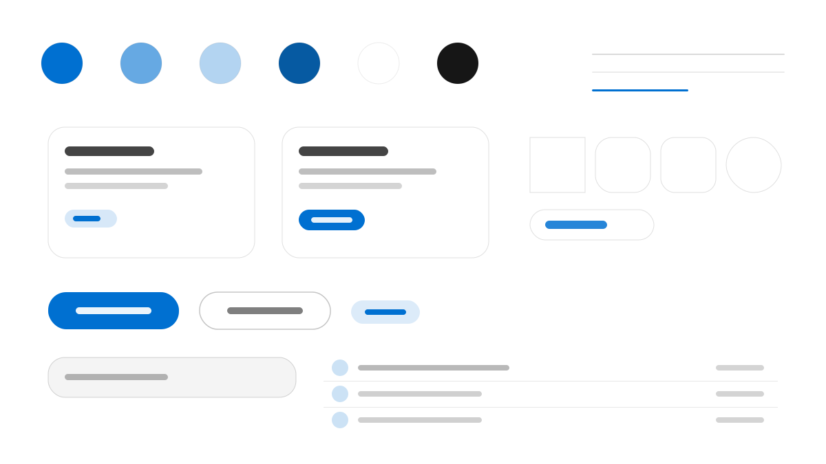
PlayStation は Sony のゲームブランドで、UI は 3 層の「チャネル」構造を採用しています。ほぼ黒のヒーローエリア、紙のような白のコンテンツエリア、コバルトブルーのフッターが並び、色面は混ざり合わずに交互に切り替わります。SST 書体はウェイト 300、22〜54px で「静かな支配感」を表現します。PlayStation Blue(#0070cc)がブランドをアンカリングし、シアンはホバーとフォーカスにのみ使用。すべてのインタラクティブ要素はホバーで 1.2 倍に拡大し、ボタンは全ピル型、カード面は 12〜24px の角丸です。
PlayStationメディアと消費
プロンプトテンプレート
基本テンプレート
Design a PlayStation-inspired interface. - Three-surface channel layout: near-black hero, paper-white content, cobalt-blue footer — alternating, never blending; - SST weight 300 at 22–54px for display — "quiet authority" headlines that let product photography lead; - PlayStation Blue #0070cc as the brand anchor; cyan #1eaedb reserved exclusively for hover/focus states; - Every interactive element scales 1.2× on hover — a signature "power-on" lift unique to PlayStation; - Pill buttons at full 999px radius; card art in rounded 12–24px rectangles. Colors: #0070cc, #000000, #1eaedb, #ffffff with #0070cc accent. Typography: - Background:.
バリエーションプロンプト
📱 モバイル
Design a mobile app with PlayStation aesthetics. Use PlayStation color identity with #0070cc accents. Clean, touch-friendly, native feel.
💻 Web
Design a web application with PlayStation style. Use PlayStation color identity with #0070cc accents. Professional, responsive layout.
📊 ダッシュボード
Design a dashboard with PlayStation design language. Use PlayStation color identity with #0070cc accents. Data-rich, organized, clear hierarchy.
📄 ランディングページ
Design a landing page with PlayStation visual identity. Use PlayStation color identity with #0070cc accents. Compelling, conversion-focused.
使用例
PlayStation アプリ
WebBuild a web app with PlayStation design language and #0070cc color system.
PlayStation ダッシュボード
ダッシュボードCreate a dashboard using PlayStation style with data visualization and - Background: typography.
✅ 適した用途
- コンシューマー製品
- ゲーム機とストア
- 娯楽コンテンツのチャネル
❌ 適さない用途
- エンタープライズの管理画面システム
- フォーマルなビジネス公式サイト
DESIGN.md ファイル
design.md オープン形式に準拠したデザインシステム記述。コピーまたはダウンロードして AI コーディングツールに渡せます。