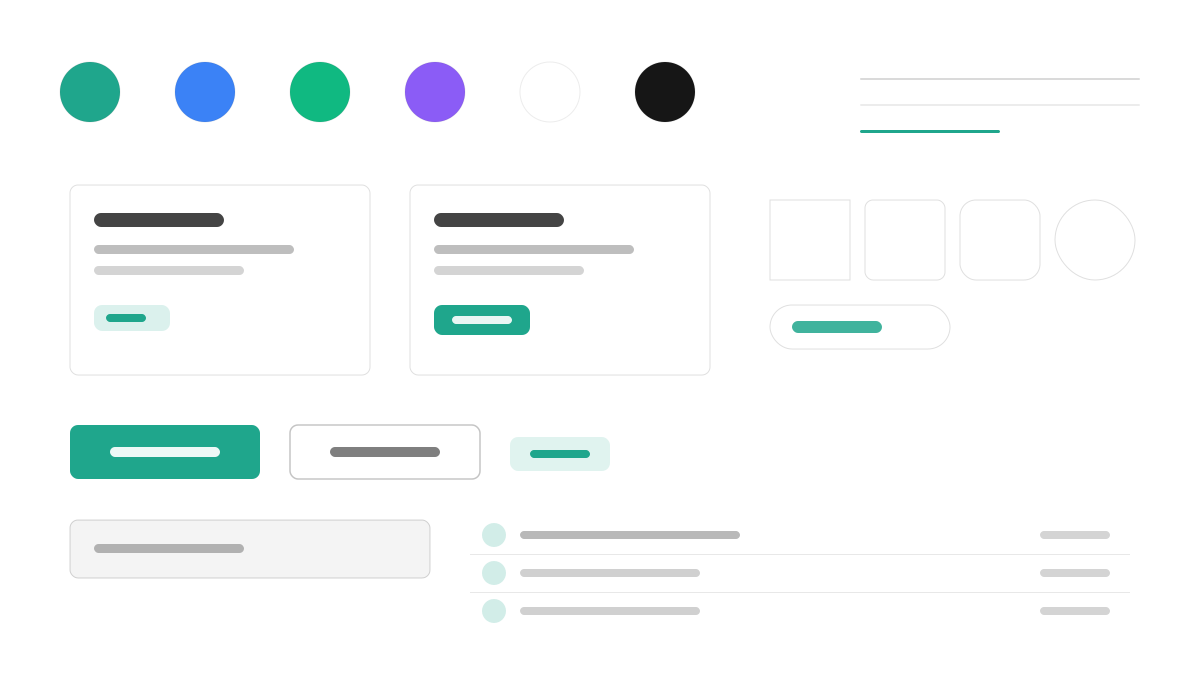
Park UI は Ark UI エコシステムにおける「shadcn/ui」です。コンポーネントはコピー&ペーストであなたのコードベースに入り、土台には Ark UI の振る舞いプリミティブと Panda CSS のスタイルエンジンがあります。WAI-ARIA パターンとキーボードナビゲーションは標準で基準を満たし、React、Vue、Solid が同じコンポーネント群を共有します。バリアントは Panda のレシピシステムで型安全に定義され、主色は青緑(#1FA68C)です。マルチフレームワークのチームと、ソースコードを掌握したいフロントエンドエンジニアに適しています。
Park UIフロントエンドフレームワーク
プロンプトテンプレート
基本テンプレート
Design a Park UI-inspired interface. - Copy-paste component model similar to shadcn/ui but for Ark UI ecosystem; - Built on Ark UI primitives with Panda CSS styling; - Accessible by default: WAI-ARIA patterns, keyboard navigation; - Multi-framework: React, Vue, Solid support via Ark UI; - Type-safe variants with Panda CSS recipe system. Colors: #1FA68C, #10B981, #3B82F6, #8B5CF6 with #1FA68C accent. Typography: system-ui.
バリエーションプロンプト
📱 モバイル
Design a mobile app with Park UI aesthetics. Use Park UI color identity with #1FA68C accents. Clean, touch-friendly, native feel.
💻 Web
Design a web application with Park UI style. Use Park UI color identity with #1FA68C accents. Professional, responsive layout.
📊 ダッシュボード
Design a dashboard with Park UI design language. Use Park UI color identity with #1FA68C accents. Data-rich, organized, clear hierarchy.
📄 ランディングページ
Design a landing page with Park UI visual identity. Use Park UI color identity with #1FA68C accents. Compelling, conversion-focused.
使用例
Park UI コンポーネントライブラリ
WebBuild a component library with Park UI design language, copy-paste components, and #1FA68C color system.
Park UI ダッシュボード
ダッシュボードCreate a dashboard using Park UI style with Ark UI primitives and Panda CSS tokens.
✅ 適した用途
- フレームワークエコシステム
- デザインシステムの基盤
- Ark UI エコシステム
❌ 適さない用途
- Panda CSS 以外の技術スタック
- ランタイムでの完全なテーマ切り替えが必要な重量級アプリ
DESIGN.md ファイル
design.md オープン形式に準拠したデザインシステム記述。コピーまたはダウンロードして AI コーディングツールに渡せます。