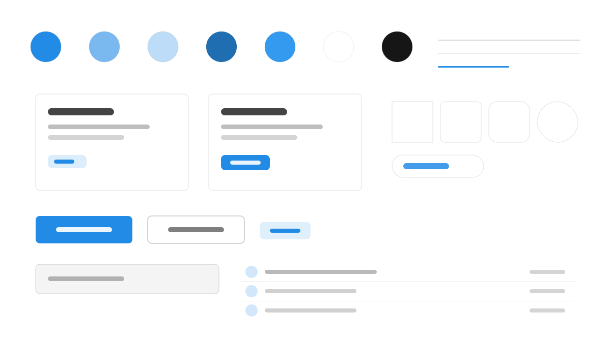
Mantine は機能が充実した React コンポーネントライブラリで、120 以上のコンポーネント、hooks、ユーティリティ関数がフォームからリッチテキストまで日常的なニーズをカバーします。デザイン面では Inter にゆとりのある行高、14px の基準文字サイズを組み合わせ、主色の青(#339AF0)が 10 段階の色階を展開します。デフォルト 4px の角丸、カードの 16px の内側余白、1px の細いボーダーが抑制の効いた爽やかさを生み、ライトとダークのテーマは同等の市民として設計されています。すぐ使えることとライト/ダークテーマの一貫性を求める React アプリに適しています。
Mantineフロントエンドフレームワーク
プロンプトテンプレート
基本テンプレート
Design a Mantine-inspired interface. - Inter with generous line-height; 14px base, 600-weight headings; - #339AF0 primary across a 10-shade palette; - 4px default radius, 16px card padding, subtle 1px borders; - Light and dark themes designed as equal citizens; - Clean forms, segmented controls, and gradient-free surfaces. Colors: #339AF0, #FFFFFF, #F8F9FA, #212529 with #339AF0 accent. Typography: Inter.
バリエーションプロンプト
📱 モバイル
Design a mobile app with Mantine aesthetics. Use Mantine color identity with #339AF0 accents. Clean, touch-friendly, native feel.
💻 Web
Design a web application with Mantine style. Use Mantine color identity with #339AF0 accents. Professional, responsive layout.
📊 ダッシュボード
Design a dashboard with Mantine design language. Use Mantine color identity with #339AF0 accents. Data-rich, organized, clear hierarchy.
📄 ランディングページ
Design a landing page with Mantine visual identity. Use Mantine color identity with #339AF0 accents. Compelling, conversion-focused.
使用例
Mantine SaaS ダッシュボード
ダッシュボードBuild a SaaS dashboard with Mantine style: AppShell layout, stat cards, segmented controls, and #339AF0 accent color.
Mantine 設定パネル
WebCreate a settings panel with Mantine design language: form sections, switches, and dark-mode-ready surfaces with Inter typography.
✅ 適した用途
- React プロジェクト
- SaaS 製品
- ダークモードアプリ
❌ 適さない用途
- React 以外のプロジェクト
- 純 CSS のミニマルサイト
DESIGN.md ファイル
design.md オープン形式に準拠したデザインシステム記述。コピーまたはダウンロードして AI コーディングツールに渡せます。