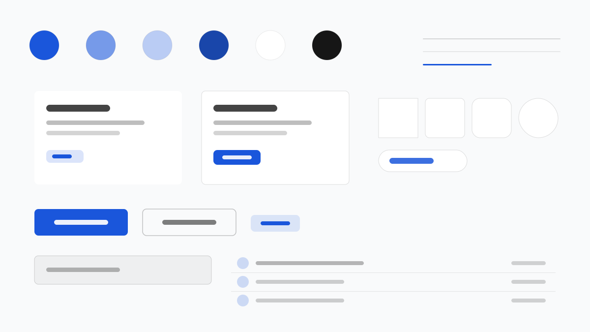
Flowbite は Tailwind CSS の上に構築されたコンポーネントライブラリで、「コピーしてすぐ使える」方式でダッシュボード、フォームからマーケティングブロックまで一式のパターンを提供します。主色の青(#1A56DB)が Gray 50〜900 のグレースケールを統括し、コンポーネントは 8px の角丸と抑制されたシャドウを多用。ダークモードは dark: バリアントによってファーストクラスでサポートされます。管理画面とマーケティングサイトを素早く納品したいチームに適しています。
Flowbiteフロントエンドフレームワーク
プロンプトテンプレート
基本テンプレート
Design a Flowbite-inspired interface. - Tailwind CSS component library with copy-paste patterns; - #1A56DB primary over a gray 50-900 scale; - 8px radii, rounded-lg cards and buttons, subtle shadows; - First-class dark mode via dark: variants; - Dashboards, forms, and marketing blocks as standard fixtures. Colors: #1A56DB, #F9FAFB, #111827, #6B7280 with #1A56DB accent. Typography: Inter.
バリエーションプロンプト
📱 モバイル
Design a mobile app with Flowbite aesthetics. Use Flowbite color identity with #1A56DB accents. Clean, touch-friendly, native feel.
💻 Web
Design a web application with Flowbite style. Use Flowbite color identity with #1A56DB accents. Professional, responsive layout.
📊 ダッシュボード
Design a dashboard with Flowbite design language. Use Flowbite color identity with #1A56DB accents. Data-rich, organized, clear hierarchy.
📄 ランディングページ
Design a landing page with Flowbite visual identity. Use Flowbite color identity with #1A56DB accents. Compelling, conversion-focused.
使用例
Flowbite SaaS ダッシュボード
ダッシュボードBuild a SaaS dashboard with Flowbite style: sidebar navigation, KPI cards, charts, and #1A56DB accent color.
Flowbite マーケティングブロック
ランディングページCreate a marketing page with Flowbite design language: hero, pricing tables, testimonials, and dark mode support.
✅ 適した用途
- Tailwind CSS
- ダッシュボード
- ダークモードのサイト
❌ 適さない用途
- Tailwind 以外のスタイル体系
- 複雑な状態管理を伴う重量級アプリ
DESIGN.md ファイル
design.md オープン形式に準拠したデザインシステム記述。コピーまたはダウンロードして AI コーディングツールに渡せます。