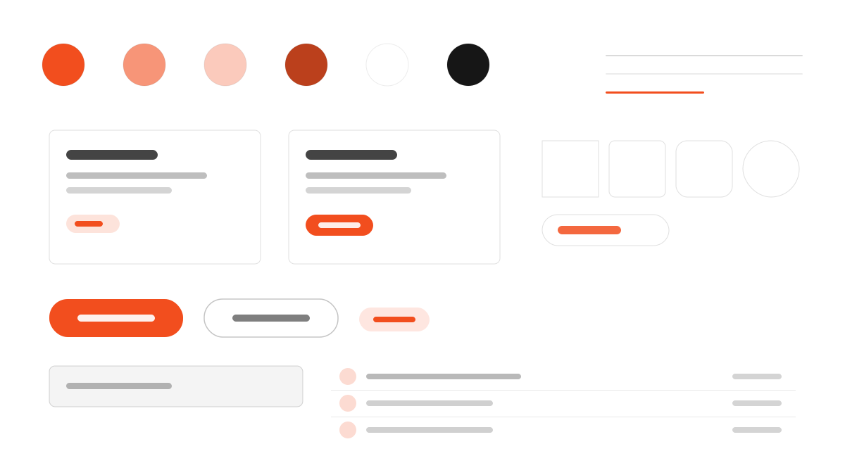
Figma はチームが一緒にアイデアをデジタルプロダクトへと変えていく協業デザインプラットフォームです。UI の chrome は厳格に白黒グレーを保ち、色はプロダクトのコンテンツの中にだけ現れます。figmaSans の可変フォントは 320 から 700 の間の独特なウェイト段階を使い、figmaMono が大文字の技術ラベルを担い、ボタンは標準的なピル型と円形の幾何学です。協業と多色づかいを強調するクリエイティブツール系の UI に適しています。
Figmaデザインとクリエイティブ
プロンプトテンプレート
基本テンプレート
Design a Figma-inspired interface. - Custom variable font (figmaSans) with unusual weight stops: 320, 330, 340, 450, 480, 540, 700; - Strictly black-and-white interface chrome — color exists only in product content; - figmaMono for uppercase technical labels with wide letter-spacing; - Pill (50px) and circular (50%) button geometry; - Dashed focus outlines echoing Figma's editor selection handles. Colors: #000000, #ffffff. Typography: figmaSans.
バリエーションプロンプト
📱 モバイル
Design a mobile app with Figma aesthetics. Use Figma color identity with #000000 accents. Clean, touch-friendly, native feel.
💻 Web
Design a web application with Figma style. Use Figma color identity with #000000 accents. Professional, responsive layout.
📊 ダッシュボード
Design a dashboard with Figma design language. Use Figma color identity with #000000 accents. Data-rich, organized, clear hierarchy.
📄 ランディングページ
Design a landing page with Figma visual identity. Use Figma color identity with #000000 accents. Compelling, conversion-focused.
使用例
Figma アプリ
WebBuild a web app with Figma design language and brand color system.
Figma ダッシュボード
ダッシュボードCreate a dashboard using Figma style with data visualization and figmaSans typography.
✅ 適した用途
- デザイン協業
- デザイン協業とプロトタイピングツール
- クリエイティブコミュニティの UI
❌ 適さない用途
- モノクロで厳格なコードターミナル
- ラグジュアリーな黒のブランドページ
DESIGN.md ファイル
design.md オープン形式に準拠したデザインシステム記述。コピーまたはダウンロードして AI コーディングツールに渡せます。