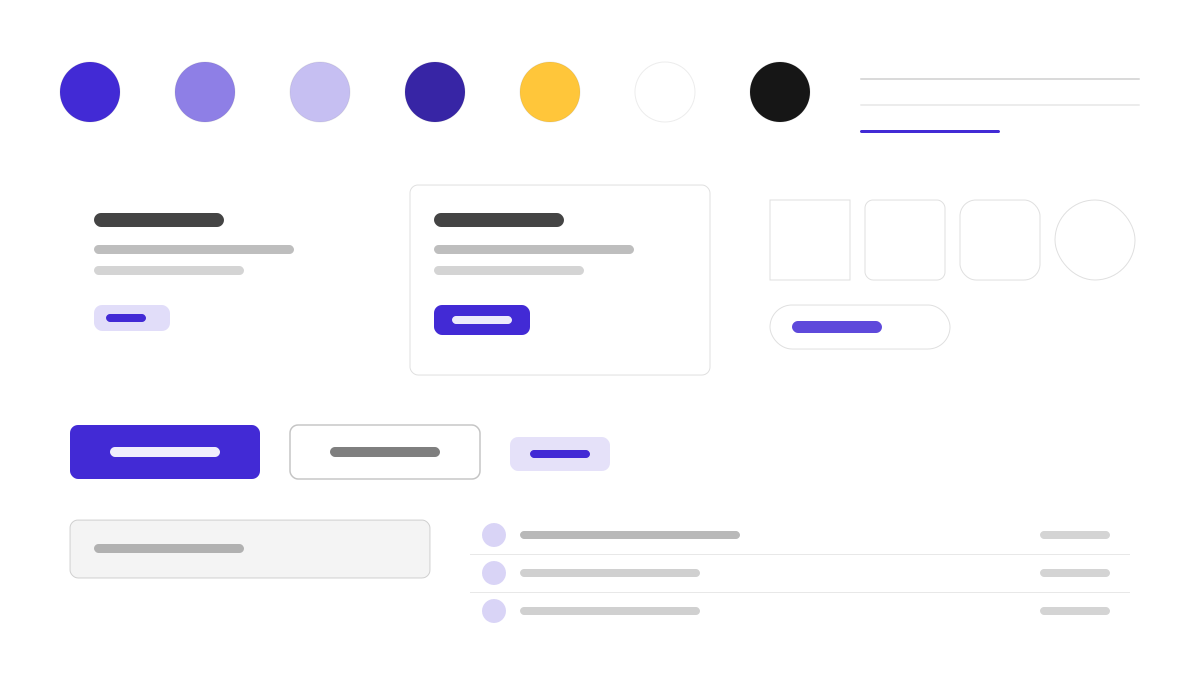
daisyUI は Tailwind の上にセマンティックなコンポーネントの層を足すテーマシステムです。btn、card、navbar、drawer といったクラス名でよく使う構造を組み上げ、30 以上の内蔵テーマをすぐに切り替えられます。デフォルトの主色は紫(#570DF8)、補助色はマゼンタと青緑。0.5rem の角丸、柔らかなシャドウ、パステルのサーフェス、明快で親しみやすいホバー状態により、カスタム CSS をほとんど書かずに済みます。Tailwind の自由度を保ちつつコンポーネントのセマンティクスも欲しいチームに適しています。
DaisyUIフロントエンドフレームワーク
プロンプトテンプレート
基本テンプレート
Design a daisyUI-inspired interface. - Semantic component classes on top of Tailwind: btn, card, navbar, drawer; - Theme system with 30+ built-in themes; light default primary #570DF8; - Rounded corners (0.5rem), soft shadows, pastel surfaces; - Friendly, approachable components with clear hover states; - Zero custom CSS — pure utility classes. Colors: #570DF8, #F000B8, #37CDBE, #FFFFFF with #570DF8 accent. Typography: system-ui.
バリエーションプロンプト
📱 モバイル
Design a mobile app with DaisyUI aesthetics. Use DaisyUI color identity with #570DF8 accents. Clean, touch-friendly, native feel.
💻 Web
Design a web application with DaisyUI style. Use DaisyUI color identity with #570DF8 accents. Professional, responsive layout.
📊 ダッシュボード
Design a dashboard with DaisyUI design language. Use DaisyUI color identity with #570DF8 accents. Data-rich, organized, clear hierarchy.
📄 ランディングページ
Design a landing page with DaisyUI visual identity. Use DaisyUI color identity with #570DF8 accents. Compelling, conversion-focused.
使用例
DaisyUI ランディングページ
ランディングページBuild a landing page with daisyUI style: hero section, feature cards, and navbar using semantic Tailwind classes and #570DF8 accent.
DaisyUI 管理パネル
ダッシュボードCreate an admin panel with daisyUI design language: drawer navigation, stat cards, and theme switcher with #570DF8 color system.
✅ 適した用途
- Tailwind CSS
- 高速プロトタイピング
- テーマ切り替え
❌ 適さない用途
- ネイティブな CSS コンポーネントライブラリが必要なチーム
- コンポーネントの挙動を深くカスタマイズするプロジェクト
DESIGN.md ファイル
design.md オープン形式に準拠したデザインシステム記述。コピーまたはダウンロードして AI コーディングツールに渡せます。