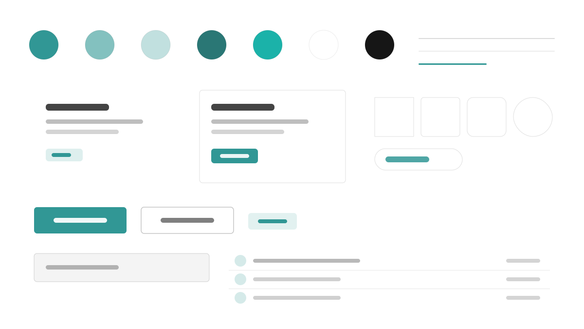
Chakra UI は「シンプル、モジュラー、アクセシブル」な React コンポーネントライブラリです。青緑の主色(#319795)に Gray 50〜900 のセマンティックトークンを組み合わせ、Inter が 16px の本文、600 の見出し、1.6 の行高で快適な読み心地を提供します。コンポーネントは 6px の角丸、シャドウは薄く階層的に重なり、すべてのインタラクティブ要素に見えるフォーカスリングを持たせています。余白は 4px スケールに従い、style props で直接記述できます。フォームが多く、アクセシビリティを優先する React アプリに適しています。
Chakra UIフロントエンドフレームワーク
プロンプトテンプレート
基本テンプレート
Design a Chakra UI-inspired interface. - Teal #319795 primary with semantic tokens across gray 50-900; - Inter with 16px body, 600-weight headings, balanced line-height 1.6; - 6px radii, faint layered shadows, visible focus rings on every interactive element; - Style-props-driven spacing on a 4px scale; - Friendly forms, badges, and accessible modal patterns. Colors: #319795, #FFFFFF, #EDF2F7, #1A202C with #319795 accent. Typography: Inter.
バリエーションプロンプト
📱 モバイル
Design a mobile app with Chakra UI aesthetics. Use Chakra UI color identity with #319795 accents. Clean, touch-friendly, native feel.
💻 Web
Design a web application with Chakra UI style. Use Chakra UI color identity with #319795 accents. Professional, responsive layout.
📊 ダッシュボード
Design a dashboard with Chakra UI design language. Use Chakra UI color identity with #319795 accents. Data-rich, organized, clear hierarchy.
📄 ランディングページ
Design a landing page with Chakra UI visual identity. Use Chakra UI color identity with #319795 accents. Compelling, conversion-focused.
使用例
Chakra UI の SaaS ダッシュボード
ダッシュボードBuild a SaaS dashboard with Chakra UI style: sidebar layout, stat cards, data tables, and #319795 accent color.
Chakra UI マーケティングサイト
ランディングページCreate a marketing website with Chakra UI design language: hero, feature grids, pricing cards, and accessible form components.
✅ 適した用途
- React プロジェクト
- アクセシビリティ重視の製品
- デザインシステム
❌ 適さない用途
- ランタイムゼロの性能を追求するプロジェクト
- 完全ヘッドレスでノンスタイルを求める要件
DESIGN.md ファイル
design.md オープン形式に準拠したデザインシステム記述。コピーまたはダウンロードして AI コーディングツールに渡せます。