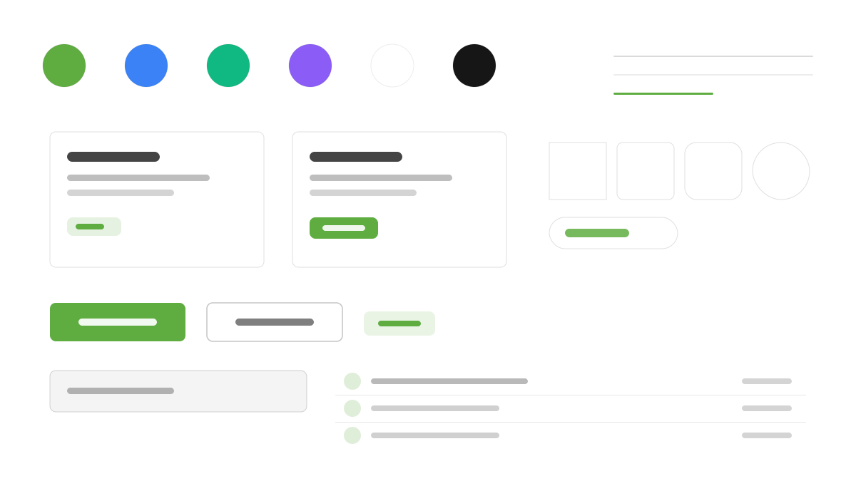
Ark UI はフレームワークをまたいで使えるヘッドレスプリミティブライブラリです。45 以上のコンポーネントは完全にノンスタイルで、CSS はあなたの Tailwind に委ねます。振る舞いの層は Zag.js のステートマシンが駆動するため、コンポーネントの動作は予測可能でテストしやすく、React、Vue、Solid、Svelte が同一の API を共有します。ARIA ロール、キーボードナビゲーション、フォーカス管理は標準で WCAG に準拠します。デザインシステムを自前で構築するチームやマルチフレームワークのコードベースに適しています。
Ark UIフロントエンドフレームワーク
プロンプトテンプレート
基本テンプレート
Design a Ark UI-inspired interface. - Completely unstyled headless primitives — bring your own CSS with Tailwind; - Zag.js state machine-driven: predictable, testable component behavior; - WCAG-compliant accessibility: ARIA roles, keyboard navigation, focus management; - Same API across React, Vue, Solid, and Svelte; - 50+ composable components: Dialog, Menu, Tabs, Accordion, Carousel, and more. Colors: #5FAD41, #10B981, #3B82F6, #8B5CF6 with #5FAD41 accent. Typography: system-ui.
バリエーションプロンプト
📱 モバイル
Design a mobile app with Ark UI aesthetics. Use Ark UI color identity with #5FAD41 accents. Clean, touch-friendly, native feel.
💻 Web
Design a web application with Ark UI style. Use Ark UI color identity with #5FAD41 accents. Professional, responsive layout.
📊 ダッシュボード
Design a dashboard with Ark UI design language. Use Ark UI color identity with #5FAD41 accents. Data-rich, organized, clear hierarchy.
📄 ランディングページ
Design a landing page with Ark UI visual identity. Use Ark UI color identity with #5FAD41 accents. Compelling, conversion-focused.
使用例
Ark UI コンポーネントデモ
WebBuild a component showcase with Ark UI design language, accessible dialogs, menus, and #5FAD41 color system.
Ark UI ダッシュボード
ダッシュボードCreate a dashboard using Ark UI style with headless primitives styled by Tailwind CSS.
✅ 適した用途
- フレームワークエコシステム
- デザインシステムの基盤
- クロスフレームワークプロジェクト
❌ 適さない用途
- 既成のビジュアルスタイルが必要なプロジェクト
- JS なしの純 CSS 静的サイト
DESIGN.md ファイル
design.md オープン形式に準拠したデザインシステム記述。コピーまたはダウンロードして AI コーディングツールに渡せます。