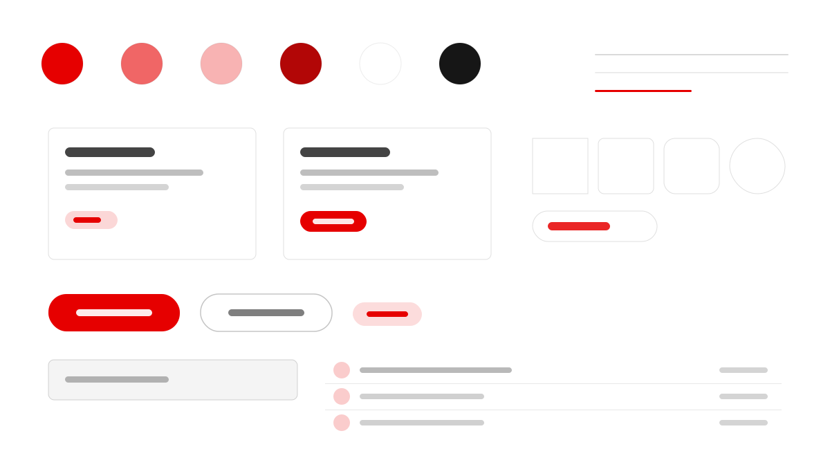
Vodafone is the global telecom operator connecting people, homes, and businesses. Its interface makes Vodafone Red (#e60000) the single dominant accent — CTAs, dividers, band sections, the speech-mark logo, even the rotated 'IMPACT' type on its sustainability map. Monumental 144px uppercase display at weight 800 pairs with calm 16–18px body copy, and pages keep a universal rhythm from atmospheric hero to uppercase headline, full-width red band, white editorial canvas, and charcoal institutional panel.
ConsumerEditorial
Prompt Template
Base Template
Design a Vodafone-inspired interface. - Vodafone Red (#e60000) is the single dominant accent — used for CTAs, dividers, band sections, the speech-mark logo, and the rotated "IMPACT" brand-mark type on the sustainability map; - Monumental uppercase display type (up to 144px, weight 800, negative letter-spacing) paired with calm 16-18px body copy; - A universal page rhythm: dark atmospheric hero → monumental uppercase headline → full-width red band → white editorial canvas → dark charcoal institutional panel → charcoal footer; - Two-tier button system: tight 2px-radius rectangles for utility actions, fully-pill 60px buttons for primary content CTAs (both equally primary, selected by context); - Documentary photography (people, infrastructure, cities, nature) dominates over illustration; no stock-icon noise. Colors: #e60000, #ffffff, #3860be, #ac1811 with #e60000 accent. Typography: Vodafone.
Variant Prompts
📱 Mobile
Design a mobile app with Vodafone aesthetics. Use Vodafone color identity with #e60000 accents. Clean, touch-friendly, native feel.
💻 Web
Design a web application with Vodafone style. Use Vodafone color identity with #e60000 accents. Professional, responsive layout.
📊 Dashboard
Design a dashboard with Vodafone design language. Use Vodafone color identity with #e60000 accents. Data-rich, organized, clear hierarchy.
📄 Landing Page
Design a landing page with Vodafone visual identity. Use Vodafone color identity with #e60000 accents. Compelling, conversion-focused.
Usage Examples
Vodafone App
WebBuild a web app with Vodafone design language and #e60000 color system.
Vodafone Dashboard
DashboardCreate a dashboard using Vodafone style with data visualization and Vodafone typography.
✅ Best For
- Consumer
- Telecom brand websites
- Display typography pages
❌ Avoid For
- Minimal black-and-white tools
- Dense data back offices
DESIGN.md File
A design system description in the open design.md format. Copy or download it and hand it to AI coding tools.