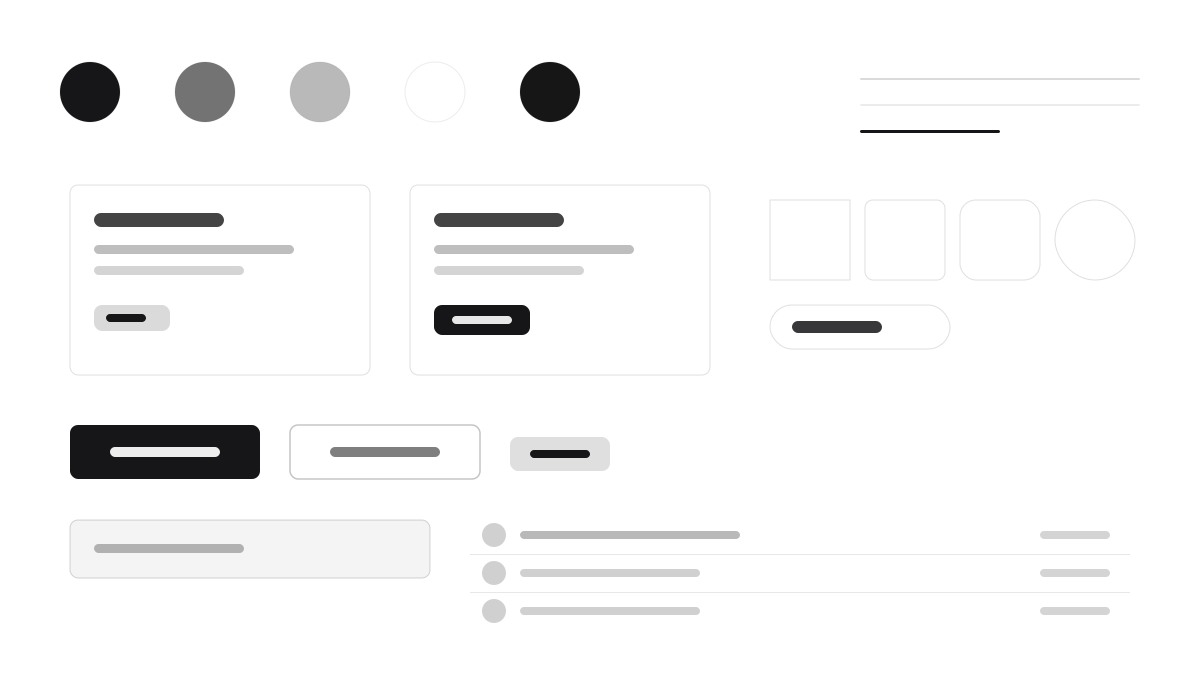
Radix UI pioneered the headless primitive: Dialog, DropdownMenu, Tooltip, and Tabs ship behavior and accessibility only, with the skin entirely yours. The official aesthetic shows near-black (#161618) surfaces with crisp white text, tightly tracked Inter, 8px radii, hairline borders at low white opacity, and high-contrast focus rings driven by data-state styling. Made for teams building design systems on a behavior-only base.
Radix UIFramework
Prompt Template
Base Template
Design a Radix UI-inspired interface. - Unstyled, accessible primitives: Dialog, DropdownMenu, Tooltip, Tabs; - Near-black #161618 surfaces with crisp white text; - Inter with tight tracking; 8px radii, hairline borders at low white opacity; - High-contrast focus rings and data-state driven styling; - Bring your own visual layer — Radix ships behavior, not skin. Colors: #161618, #FFFFFF, #1F1F23, #2A2A30 with #161618 accent. Typography: Inter.
Variant Prompts
📱 Mobile
Design a mobile app with Radix UI aesthetics. Use Radix UI color identity with #161618 accents. Clean, touch-friendly, native feel.
💻 Web
Design a web application with Radix UI style. Use Radix UI color identity with #161618 accents. Professional, responsive layout.
📊 Dashboard
Design a dashboard with Radix UI design language. Use Radix UI color identity with #161618 accents. Data-rich, organized, clear hierarchy.
📄 Landing Page
Design a landing page with Radix UI visual identity. Use Radix UI color identity with #161618 accents. Compelling, conversion-focused.
Usage Examples
Radix Component Playground
WebBuild a component playground with Radix UI primitives: dialogs, dropdown menus, tooltips, and accessible keyboard navigation.
Radix Dark App Shell
DashboardCreate a dark app shell with Radix UI design language: tabs, popovers, and precise focus rings on #161618 surfaces.
✅ Best For
- React
- Design system foundations
- Accessibility-critical apps
❌ Avoid For
- Teams needing a ready-made design language
- Non-React tech stacks
DESIGN.md File
A design system description in the open design.md format. Copy or download it and hand it to AI coding tools.