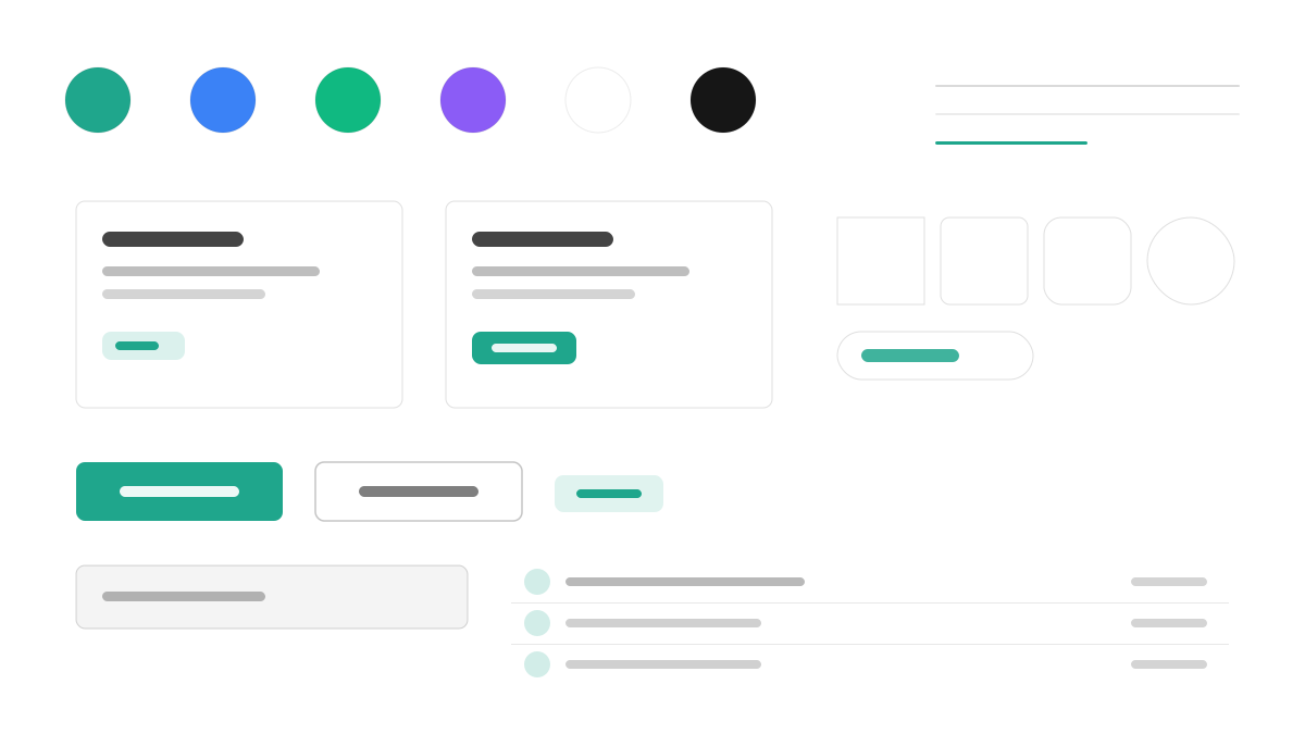
Park UI is the 'shadcn/ui' of the Ark UI ecosystem: components copy-paste into your codebase, powered by Ark UI behavior primitives and the Panda CSS styling engine. WAI-ARIA patterns and keyboard navigation pass by default, React, Vue, and Solid share one component set, and variants are type-safe through Panda's recipe system, led by teal (#1FA68C). Made for multi-framework teams that want to own the source.
ReactVueDeveloper
Prompt Template
Base Template
Design a Park UI-inspired interface. - Copy-paste component model similar to shadcn/ui but for Ark UI ecosystem; - Built on Ark UI primitives with Panda CSS styling; - Accessible by default: WAI-ARIA patterns, keyboard navigation; - Multi-framework: React, Vue, Solid support via Ark UI; - Type-safe variants with Panda CSS recipe system. Colors: #1FA68C, #10B981, #3B82F6, #8B5CF6 with #1FA68C accent. Typography: system-ui.
Variant Prompts
📱 Mobile
Design a mobile app with Park UI aesthetics. Use Park UI color identity with #1FA68C accents. Clean, touch-friendly, native feel.
💻 Web
Design a web application with Park UI style. Use Park UI color identity with #1FA68C accents. Professional, responsive layout.
📊 Dashboard
Design a dashboard with Park UI design language. Use Park UI color identity with #1FA68C accents. Data-rich, organized, clear hierarchy.
📄 Landing Page
Design a landing page with Park UI visual identity. Use Park UI color identity with #1FA68C accents. Compelling, conversion-focused.
Usage Examples
Park UI Component Library
WebBuild a component library with Park UI design language, copy-paste components, and #1FA68C color system.
Park UI Dashboard
DashboardCreate a dashboard using Park UI style with Ark UI primitives and Panda CSS tokens.
✅ Best For
- Framework
- Design system foundation
- Ark UI ecosystem
❌ Avoid For
- Non-Panda CSS tech stacks
- Heavy apps needing full runtime theming
DESIGN.md File
A design system description in the open design.md format. Copy or download it and hand it to AI coding tools.