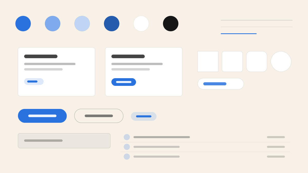
Warm paper is Oura's default world: rather than white, #f7f1e8 cream fills editorial and marketing pages, with near-black reserved for the news band and footer. Editorial New carries oversized headlines at weights 100–300 while AkkuratLL handles all body and UI labels, creating a two-voice system of serif feeling and sans-serif fact. Mustard, clay, and olive stay in bands, illustration, and data visualization; the single action blue (#2a72de) is reserved for conversion buttons, and fully rounded pills, 24px content cards, and 40px product imagery keep the rhythm soft and restrained.
OuraConsumer
Prompt Template
Base Template
Design an Oura-inspired interface. - Warm-paper canvas (#f7f1e8) as the default surface, cream rather than white, for editorial and marketing sections; - Editorial New thin serif (weights 100-300) for oversized headlines paired with AkkuratLL grotesque for body and UI; - A single action blue (#2a72de) reserved strictly for conversion pills, while earth tones such as gold #af751b, clay #6b443d, and olive #849671 live only in bands, illustration, and data viz; - Fully rounded pill buttons against 24px content cards and 40px product-image frames; - Three surface worlds in rhythm: cream editorial, near-black (#19191c) news and footer band, cool silver (#ececec) product stage. Colors: #f7f1e8, #2a72de, #4a4741, #af751b, #849671, #19191c with #2a72de accent. Typography: Editorial New and AkkuratLL.
Variant Prompts
📱 Mobile
Design a mobile app with Oura aesthetics. Use Oura color identity with #2a72de accents. Cream surfaces, serif headlines, and full-round health stats.
💻 Web
Design a web application with Oura style. Use Oura color identity with #2a72de accents. Warm paper canvas, editorial type, and calm section pacing.
📊 Dashboard
Design a dashboard with Oura design language. Use Oura color identity with #2a72de accents. Sleep scores, circular stats, and earth-tone data visualization.
📄 Landing Page
Design a landing page with Oura visual identity. Use Oura color identity with #2a72de accents. Full-bleed lifestyle photography, thin serif display, and one blue CTA.
Usage Examples
Oura Sleep Insights Dashboard
DashboardCreate a sleep insights dashboard in Oura's style: #f7f1e8 cream canvas, Editorial New headline, AkkuratLL labels, and one #2a72de action.
Oura Ring Product Page
LandingBuild an Oura Ring landing page with a silver product stage, 40px image frames, circular score badges, and an earth-tone accent band.
✅ Best For
- Health and wearable devices
- Sleep and activity data dashboards
- Premium health editorial pages
❌ Avoid For
- Clinical industrial control rooms
- High-saturation gaming interfaces
DESIGN.md File
A design system description in the open design.md format. Copy or download it and hand it to AI coding tools.