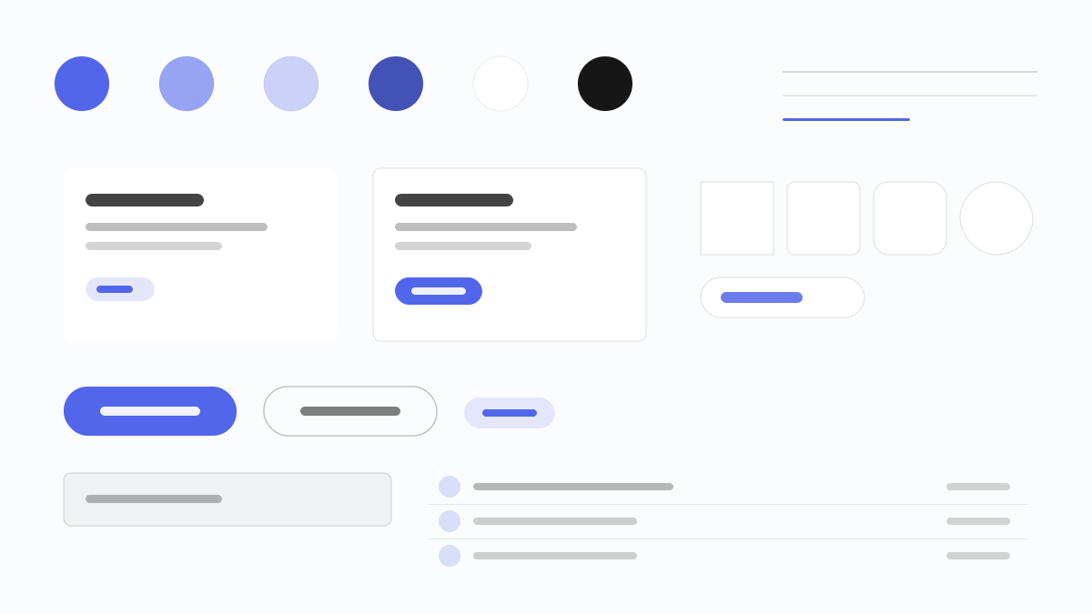
Mercury splits its interface into two native worlds: the homepage sinks into an ink-violet night (#171721) while product and pricing pages flip to a near-white canvas (#fbfcfd), with the nav and footer staying dark on every page. A single saturated indigo (#5266eb) fills the action pill and everything else is a translucent capsule. arcadia and arcadiaDisplay run at light variable weights (360 body, 420 UI, 480 headlines), and 12px cards separate by fill rather than shadow.
MercuryFintech
Prompt Template
Base Template
Design a Mercury-inspired interface. - Two native worlds: an ink-violet night homepage (#171721) and near-white product pages (#fbfcfd), framed by the same dark nav and footer; - A single saturated indigo (#5266eb) action pill with 32px corners, while every secondary action is a translucent 40px capsule; - arcadia and arcadiaDisplay at light variable weights (360 body, 420 UI, 480 headlines) with a hair of positive tracking on card titles; - Lavender (#edecfb) feature cards and #1e1e2a raised cards, separated by fill rather than borders; - Tonal elevation only -- 12px cards and faint layered shadows under the pricing table; - Uppercase eyebrows in #554e7b set the section rhythm. Colors: #171721, #5266eb, #fbfcfd, #edecfb, #ededf3 with #5266eb accent. Typography: arcadiaDisplay and arcadia, 360-480.
Variant Prompts
📱 Mobile
Design a mobile banking app with Mercury aesthetics. Deep ink-violet surfaces, one #5266eb pill action, light arcadia weights and 12px cards. Calm, touch-friendly, private-bank feel.
💻 Web
Design a web application with Mercury style. Night nav and footer framing near-white pages, #5266eb accent, translucent secondary pills and lavender feature cards. Precise, spacious, responsive.
📊 Dashboard
Design a dashboard with Mercury design language. Ink-violet shell, #5266eb active indicators, tonal 12px cards and light arcadia labels. Data-dense but quiet.
📄 Landing Page
Design a landing page with Mercury visual identity. Dark hero, #5266eb conversion pill, arcadiaDisplay headlines at 480 weight. Confident, nocturnal, conversion-focused.
Usage Examples
Mercury Account Signup
WebBuild a business banking web app with Mercury design language, #5266eb action pills and an ink-violet shell.
Mercury Treasury Dashboard
DashboardCreate a treasury dashboard using Mercury style with #5266eb indicators, tonal cards and light arcadia labels.
✅ Best For
- Digital banking and wealth products
- Business account landing pages for founders
- Finance brands that want a nocturnal, private-bank tone
❌ Avoid For
- Loud promotional campaigns
- Playful gamified budgeting apps
DESIGN.md File
A design system description in the open design.md format. Copy or download it and hand it to AI coding tools.