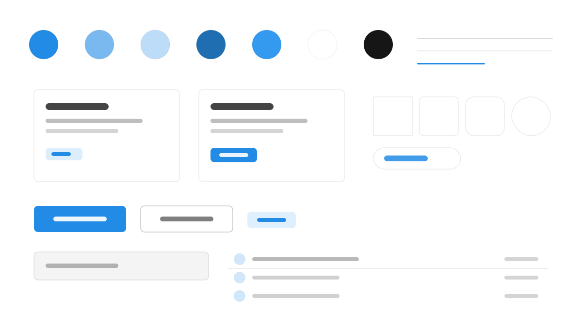
Mantine is a fully featured React library with 120+ components, hooks, and utilities spanning everyday needs from forms to rich text. Inter with generous line-height on a 14px base pairs with a 10-shade primary (#339AF0), 4px default radii, 16px card padding, and subtle 1px borders keep surfaces clean, and light and dark themes are designed as equal citizens. Made for React apps needing batteries-included theming.
MantineFramework
Prompt Template
Base Template
Design a Mantine-inspired interface. - Inter with generous line-height; 14px base, 600-weight headings; - #339AF0 primary across a 10-shade palette; - 4px default radius, 16px card padding, subtle 1px borders; - Light and dark themes designed as equal citizens; - Clean forms, segmented controls, and gradient-free surfaces. Colors: #339AF0, #FFFFFF, #F8F9FA, #212529 with #339AF0 accent. Typography: Inter.
Variant Prompts
📱 Mobile
Design a mobile app with Mantine aesthetics. Use Mantine color identity with #339AF0 accents. Clean, touch-friendly, native feel.
💻 Web
Design a web application with Mantine style. Use Mantine color identity with #339AF0 accents. Professional, responsive layout.
📊 Dashboard
Design a dashboard with Mantine design language. Use Mantine color identity with #339AF0 accents. Data-rich, organized, clear hierarchy.
📄 Landing Page
Design a landing page with Mantine visual identity. Use Mantine color identity with #339AF0 accents. Compelling, conversion-focused.
Usage Examples
Mantine SaaS Dashboard
DashboardBuild a SaaS dashboard with Mantine style: AppShell layout, stat cards, segmented controls, and #339AF0 accent color.
Mantine Settings Panel
WebCreate a settings panel with Mantine design language: form sections, switches, and dark-mode-ready surfaces with Inter typography.
✅ Best For
- React
- SaaS products
- Dark mode applications
❌ Avoid For
- Non-React projects
- Pure CSS minimal sites
DESIGN.md File
A design system description in the open design.md format. Copy or download it and hand it to AI coding tools.