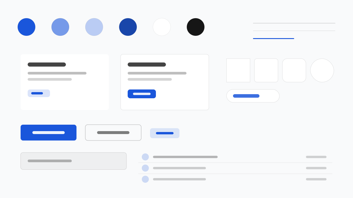
Flowbite is a Tailwind CSS component library delivering copy-paste patterns from dashboards and forms to marketing blocks. Primary blue (#1A56DB) leads over a Gray 50–900 scale, components favor 8px rounded-lg corners with subtle shadows, and first-class dark mode runs through dark: variants. Made for teams shipping admin panels and marketing sites fast.
FlowbiteFramework
Prompt Template
Base Template
Design a Flowbite-inspired interface. - Tailwind CSS component library with copy-paste patterns; - #1A56DB primary over a gray 50-900 scale; - 8px radii, rounded-lg cards and buttons, subtle shadows; - First-class dark mode via dark: variants; - Dashboards, forms, and marketing blocks as standard fixtures. Colors: #1A56DB, #F9FAFB, #111827, #6B7280 with #1A56DB accent. Typography: Inter.
Variant Prompts
📱 Mobile
Design a mobile app with Flowbite aesthetics. Use Flowbite color identity with #1A56DB accents. Clean, touch-friendly, native feel.
💻 Web
Design a web application with Flowbite style. Use Flowbite color identity with #1A56DB accents. Professional, responsive layout.
📊 Dashboard
Design a dashboard with Flowbite design language. Use Flowbite color identity with #1A56DB accents. Data-rich, organized, clear hierarchy.
📄 Landing Page
Design a landing page with Flowbite visual identity. Use Flowbite color identity with #1A56DB accents. Compelling, conversion-focused.
Usage Examples
Flowbite SaaS Dashboard
DashboardBuild a SaaS dashboard with Flowbite style: sidebar navigation, KPI cards, charts, and #1A56DB accent color.
Flowbite Marketing Blocks
LandingCreate a marketing page with Flowbite design language: hero, pricing tables, testimonials, and dark mode support.
✅ Best For
- Tailwind CSS
- Dashboards
- Dark mode sites
❌ Avoid For
- Non-Tailwind styling systems
- Heavy apps with complex state management
DESIGN.md File
A design system description in the open design.md format. Copy or download it and hand it to AI coding tools.