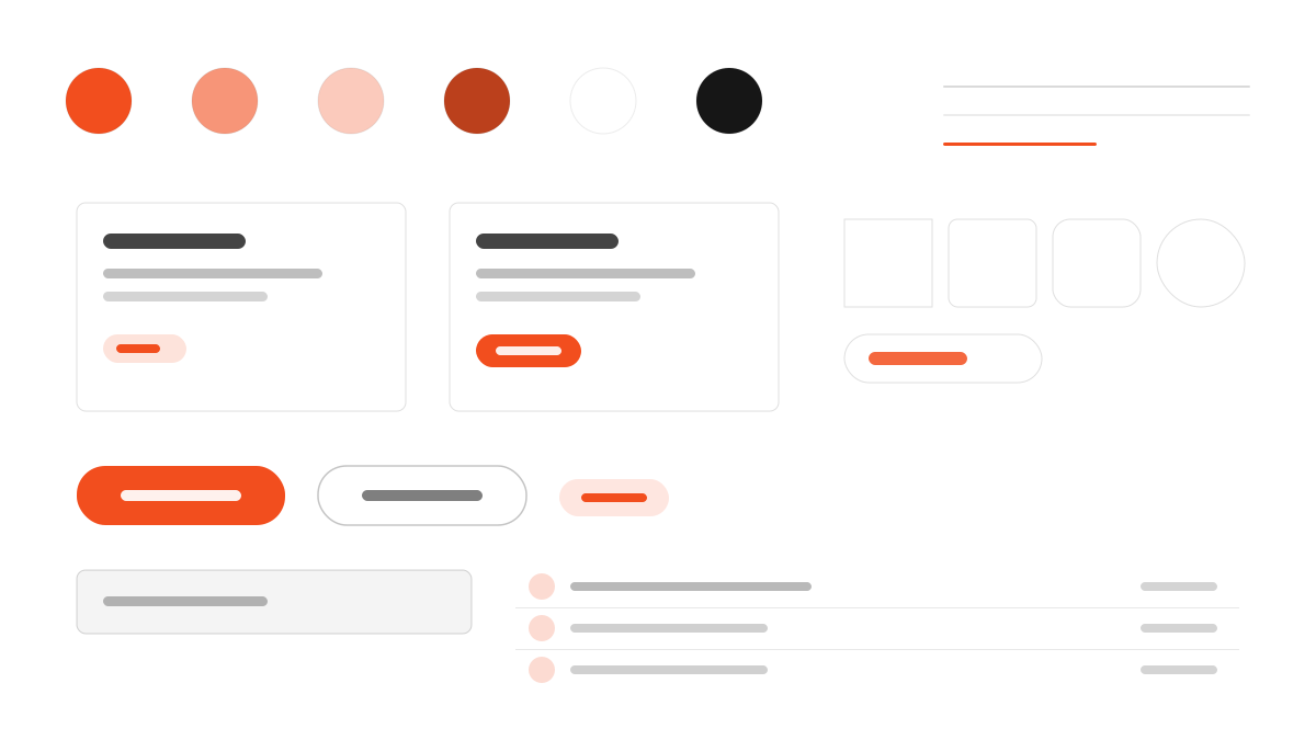
Figma is where teams turn ideas into digital products together. Its chrome stays strictly black-and-white with color reserved for product content, figmaSans moves through unusual weight stops from 320 to 700, figmaMono carries uppercase technical labels, and buttons are pills and circles. Ideal for collaboration-first creative tools.
MinimalCreative
Prompt Template
Base Template
Design a Figma-inspired interface. - Custom variable font (figmaSans) with unusual weight stops: 320, 330, 340, 450, 480, 540, 700; - Strictly black-and-white interface chrome — color exists only in product content; - figmaMono for uppercase technical labels with wide letter-spacing; - Pill (50px) and circular (50%) button geometry; - Dashed focus outlines echoing Figma's editor selection handles. Colors: #000000, #ffffff. Typography: figmaSans.
Variant Prompts
📱 Mobile
Design a mobile app with Figma aesthetics. Use Figma color identity with #000000 accents. Clean, touch-friendly, native feel.
💻 Web
Design a web application with Figma style. Use Figma color identity with #000000 accents. Professional, responsive layout.
📊 Dashboard
Design a dashboard with Figma design language. Use Figma color identity with #000000 accents. Data-rich, organized, clear hierarchy.
📄 Landing Page
Design a landing page with Figma visual identity. Use Figma color identity with #000000 accents. Compelling, conversion-focused.
Usage Examples
Figma App
WebBuild a web app with Figma design language and brand color system.
Figma Dashboard
DashboardCreate a dashboard using Figma style with data visualization and figmaSans typography.
✅ Best For
- Design
- Design collaboration and prototyping tools
- Creative community UIs
❌ Avoid For
- Monochrome serious code terminals
- Luxury black brand pages
DESIGN.md File
A design system description in the open design.md format. Copy or download it and hand it to AI coding tools.