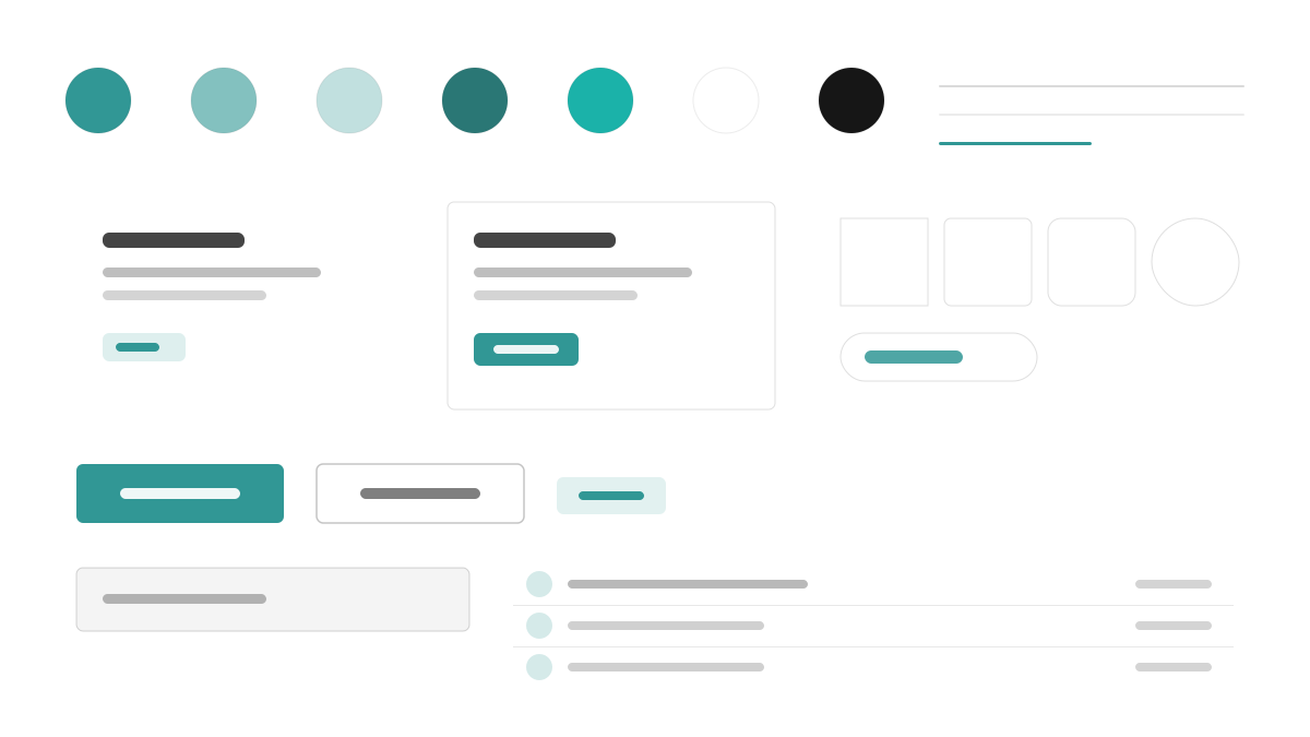
Chakra UI offers simple, modular, and accessible React components: teal (#319795) leads across semantic Gray 50–900 tokens, Inter sets 16px body with 600-weight headings at 1.6 line-height, components keep 6px radii with faint layered shadows and visible focus rings on every interactive element, and spacing runs a 4px scale written directly as style props. Made for form-heavy, accessibility-first React apps.
Chakra UIFramework
Prompt Template
Base Template
Design a Chakra UI-inspired interface. - Teal #319795 primary with semantic tokens across gray 50-900; - Inter with 16px body, 600-weight headings, balanced line-height 1.6; - 6px radii, faint layered shadows, visible focus rings on every interactive element; - Style-props-driven spacing on a 4px scale; - Friendly forms, badges, and accessible modal patterns. Colors: #319795, #FFFFFF, #EDF2F7, #1A202C with #319795 accent. Typography: Inter.
Variant Prompts
📱 Mobile
Design a mobile app with Chakra UI aesthetics. Use Chakra UI color identity with #319795 accents. Clean, touch-friendly, native feel.
💻 Web
Design a web application with Chakra UI style. Use Chakra UI color identity with #319795 accents. Professional, responsive layout.
📊 Dashboard
Design a dashboard with Chakra UI design language. Use Chakra UI color identity with #319795 accents. Data-rich, organized, clear hierarchy.
📄 Landing Page
Design a landing page with Chakra UI visual identity. Use Chakra UI color identity with #319795 accents. Compelling, conversion-focused.
Usage Examples
Chakra UI SaaS Dashboard
DashboardBuild a SaaS dashboard with Chakra UI style: sidebar layout, stat cards, data tables, and #319795 accent color.
Chakra UI Marketing Site
LandingCreate a marketing website with Chakra UI design language: hero, feature grids, pricing cards, and accessible form components.
✅ Best For
- React
- Accessible products
- Design systems
❌ Avoid For
- Projects demanding zero-runtime performance
- Fully headless unstyled requirements
DESIGN.md File
A design system description in the open design.md format. Copy or download it and hand it to AI coding tools.